- Not For Profit
- Healthcare
Sectors
- Brand Strategy
- Brand Architecture
- Stakeholder Engagement
- Brand Identity
- Brand Language
- Brand Management
Services
Guide Dogs now lives in a world that’s more complex than the one they first entered. In an increasingly competitive landscape, and in a sector that has to fight for every single dollar, the Guide Dogs brand needed to work twice as hard to give the organisation a clear and compelling competitive advantage, whether it’s pitching for grants, communicating the value of donations, or retaining and attracting the best talent.
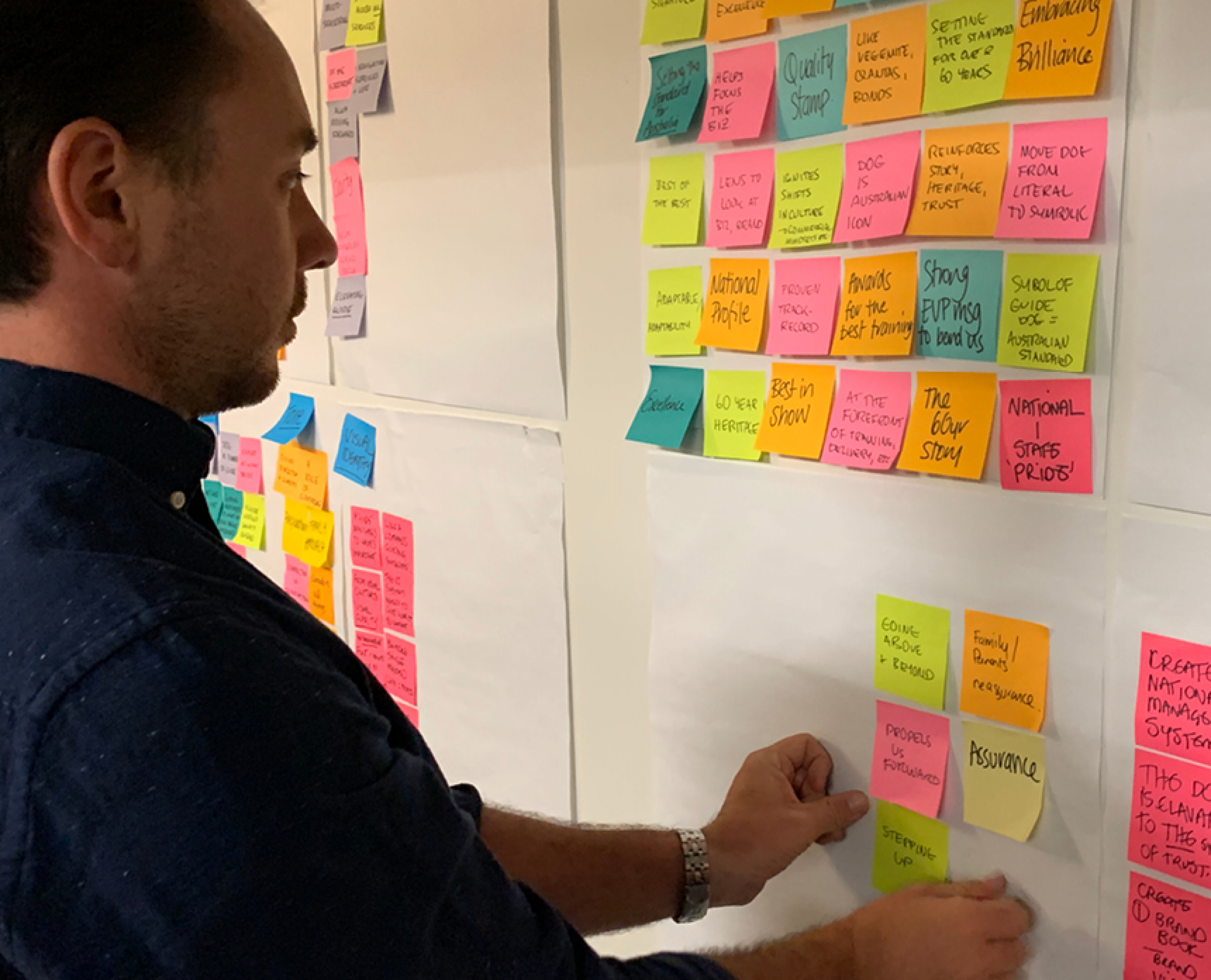
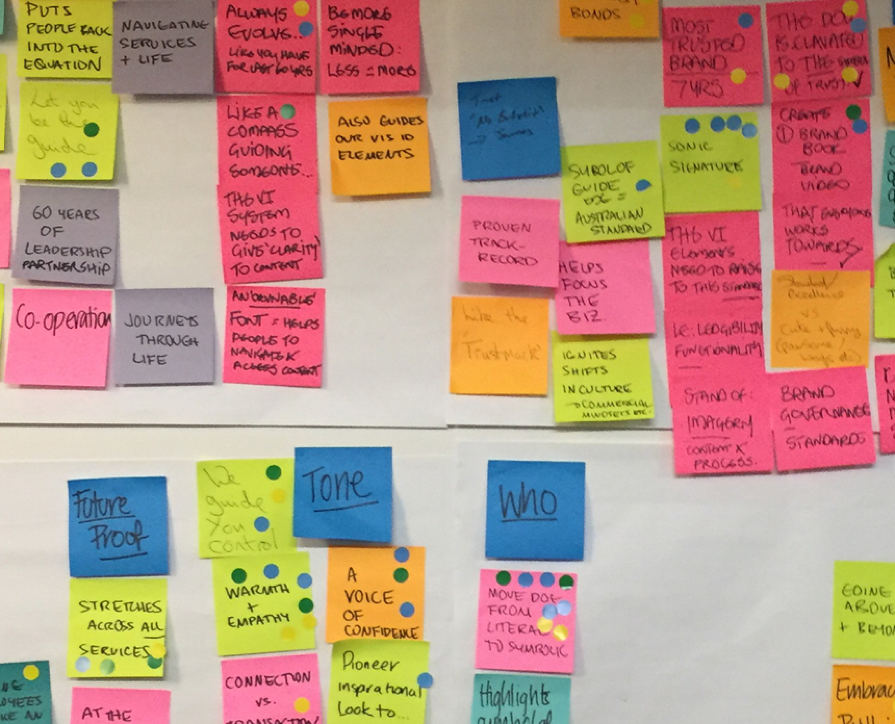
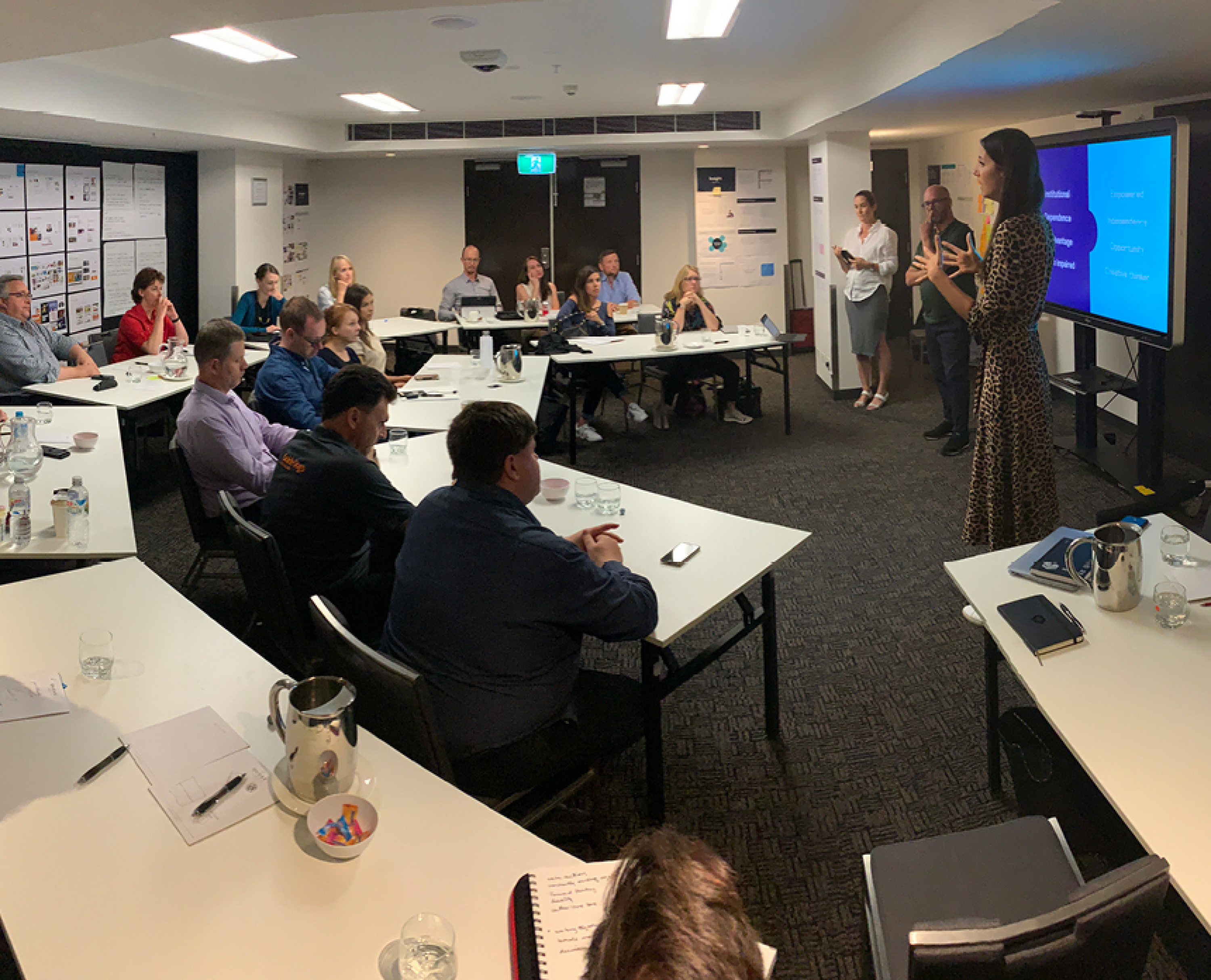
To cut through, Guide Dogs needed to connect their federated state-based organisations, under a consistent brand to work as a national force for good. With the power of unity, they could reach more clients and more donors, more effectively. And in coming together, they could also begin to tell a much richer story of service and support. A story that's about more than dogs. If we were to unite people, we knew we needed to bring them together physically in the one room. Working alongside clients, donors, referrers and staff from around the country, we applied a sprint-based methodology to explore the full range of issues and opportunities. Two days of rigorous and rapid thinking with a focus on tangible outcomes.
In the absence of a unifying purpose, FutureBrand first set about unearthing the single trait that ties each of the federated state bodies together – something that clearly states, ‘this is who we are’. Our brand idea, ‘Find your way’, allows Guide Dogs to talk to all of their stakeholder groups – clients, donors, referrers and staff from around the country. For clients it’s about the connection a Guide Dog or other services provided; for donors it’s about finding a way to leave their legacy; for employees it’s to find a way to make a real difference.
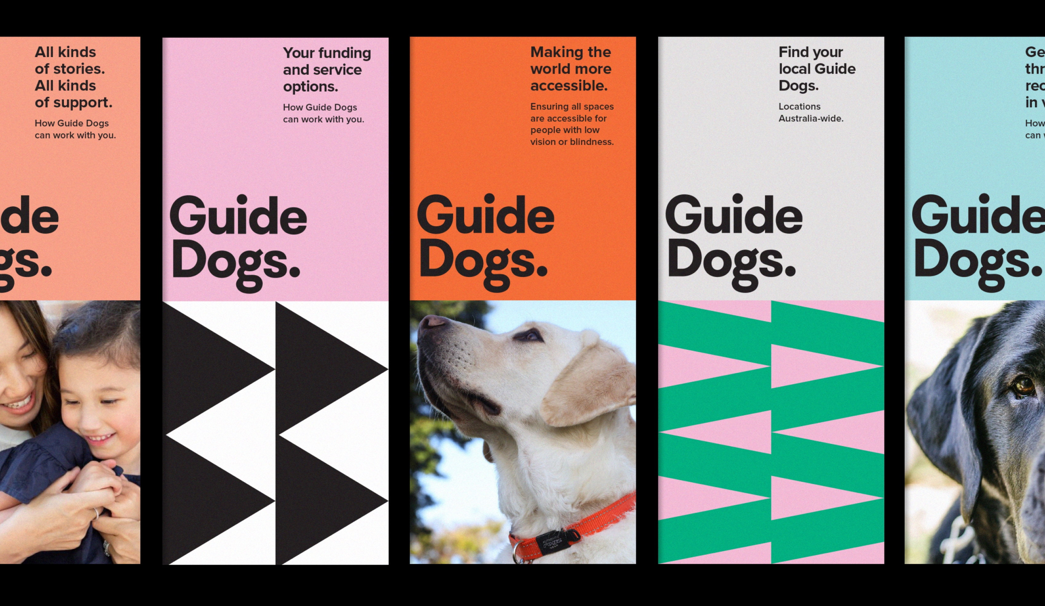
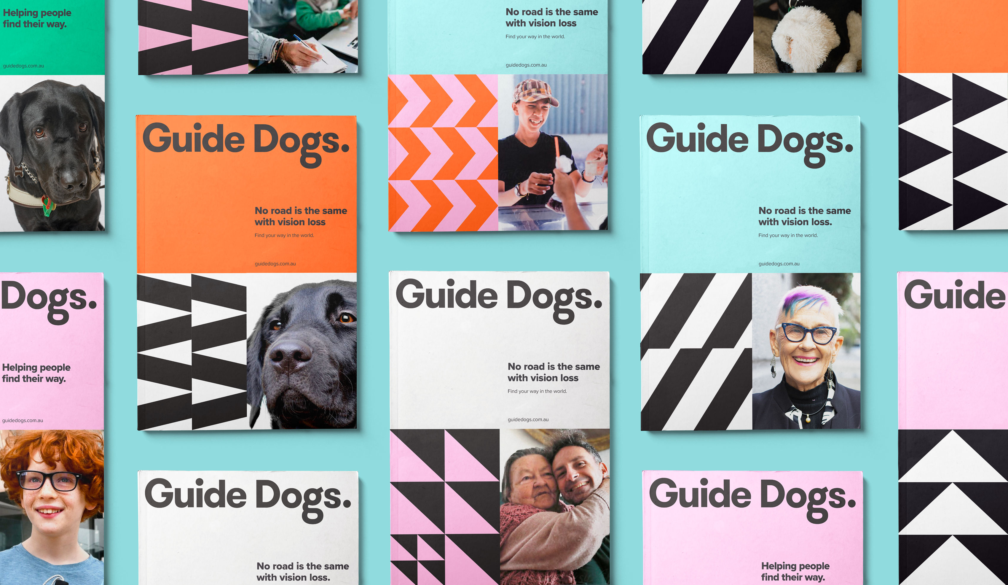
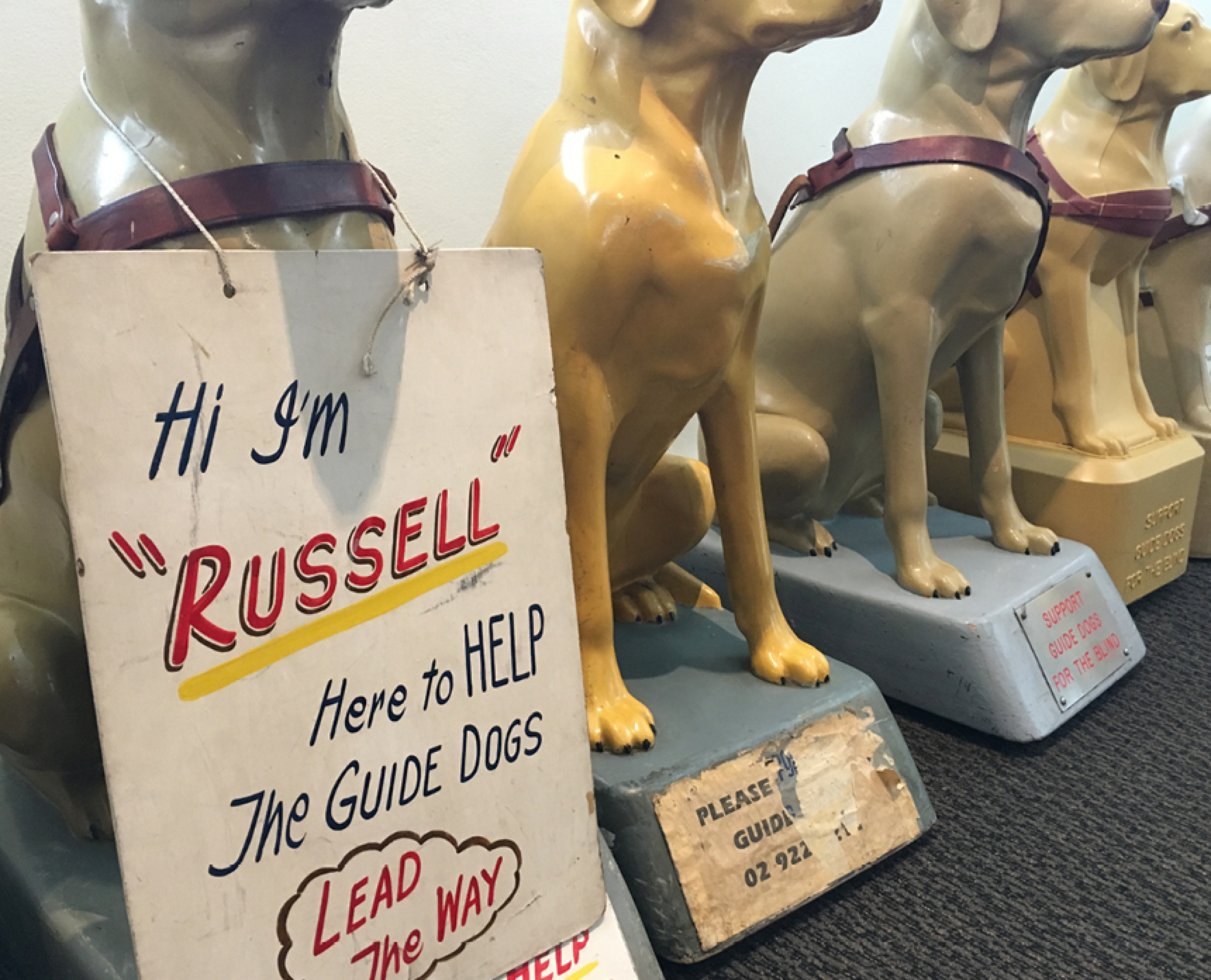
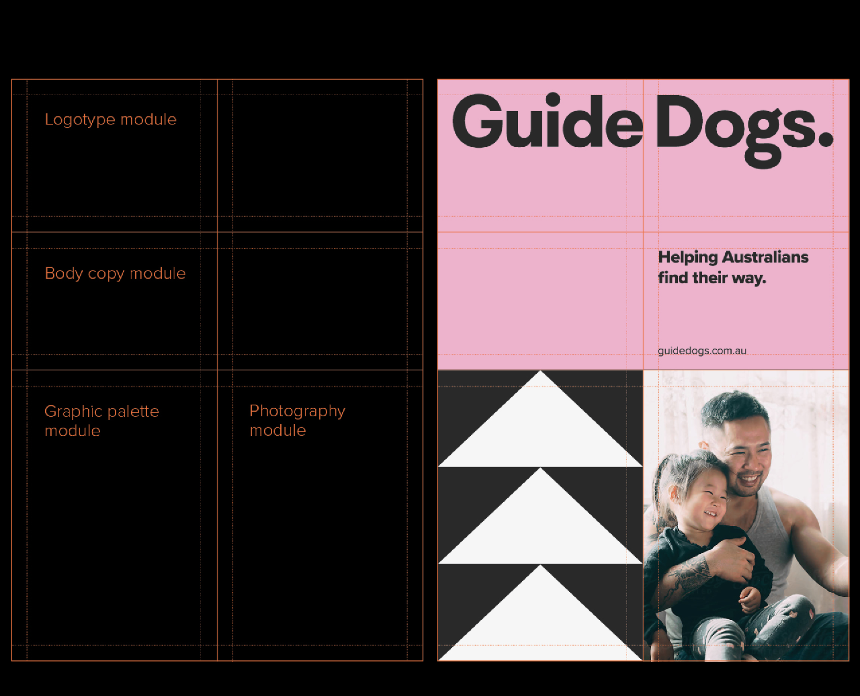
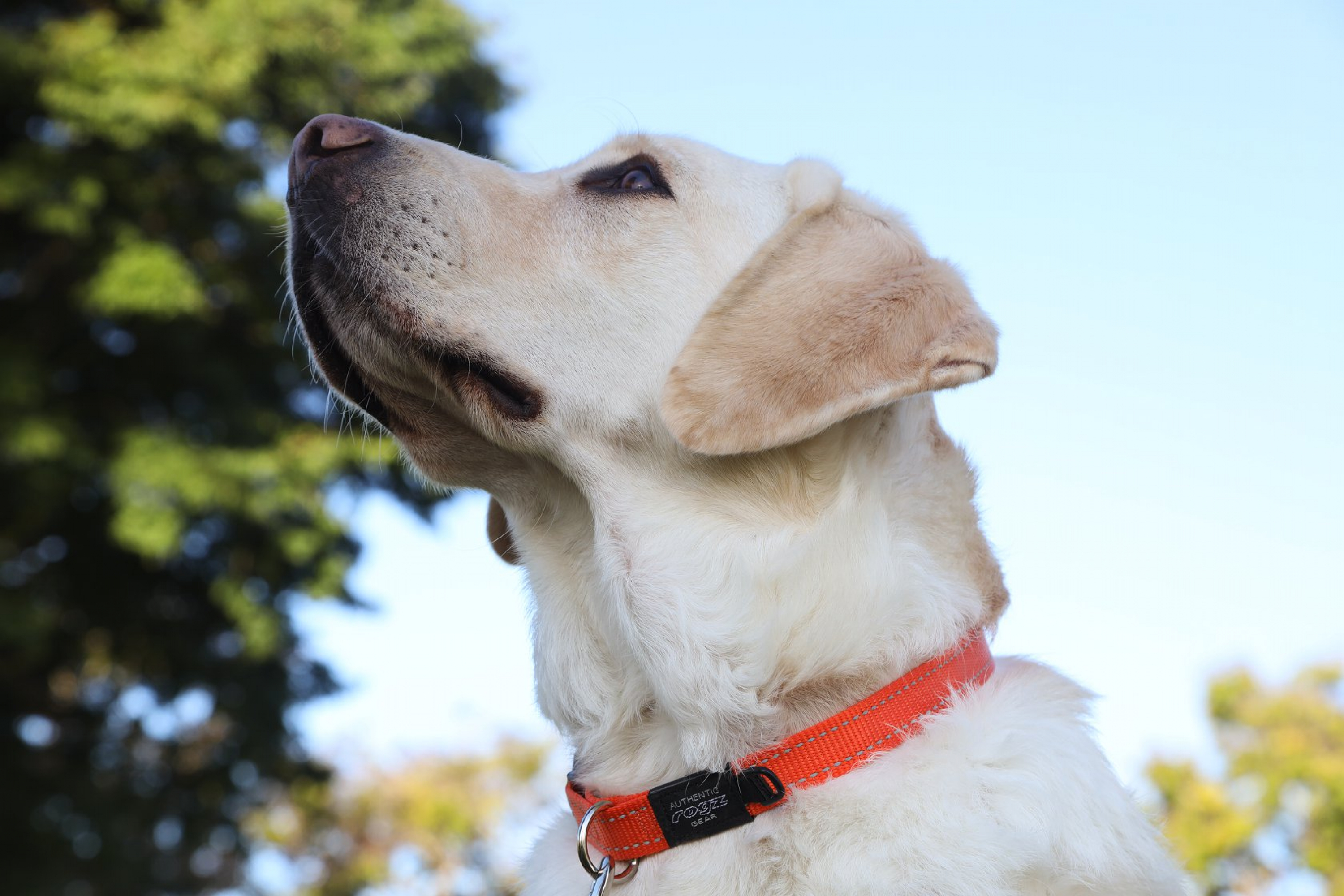
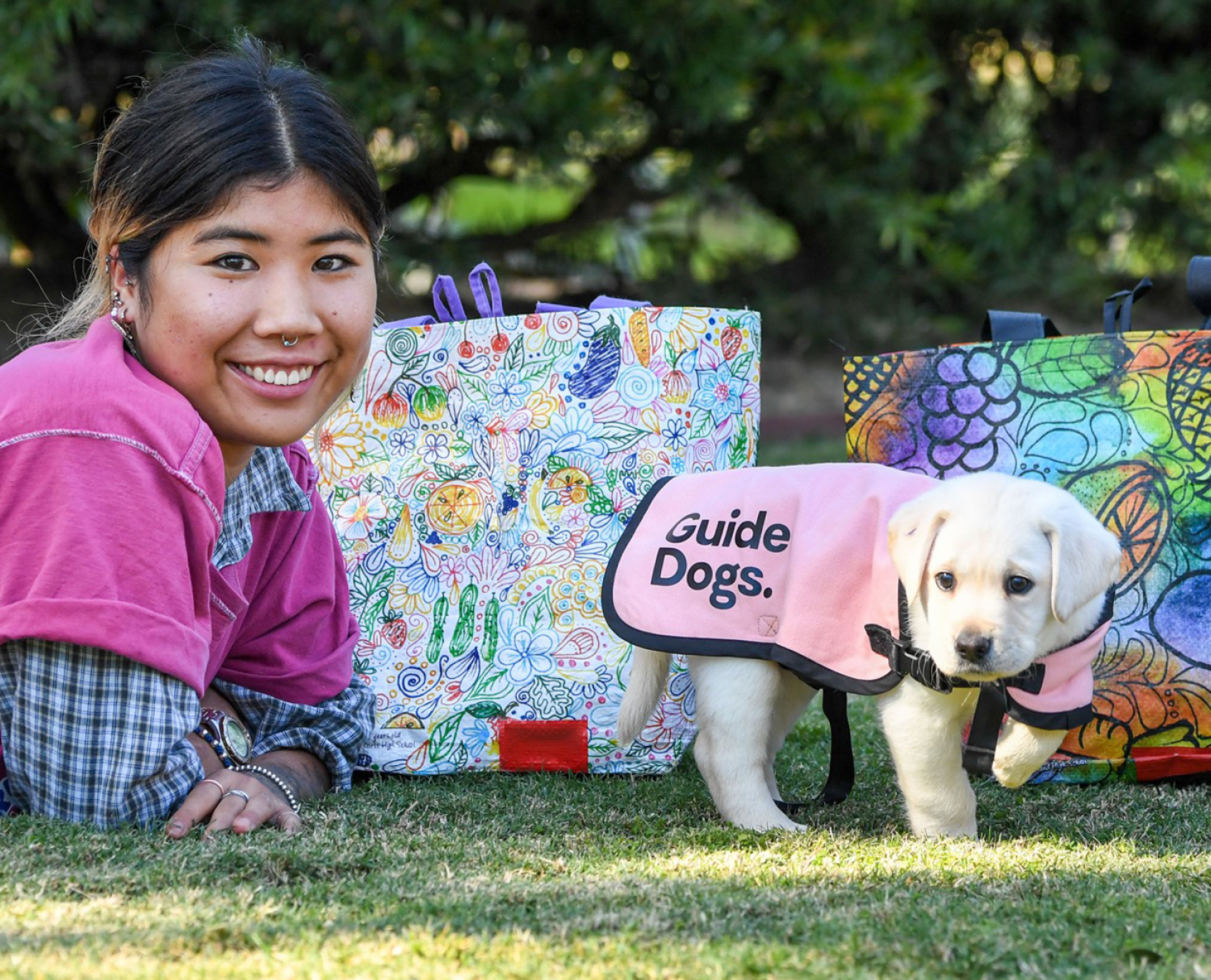
With a renewed focus on clarity and accessibility, a robust and clean sans serif typeface was chosen to carry the Guide Dogs brand into the future. Embracing the notion that we're more than dogs, the golden Labrador was retired from the logomark allowing the brand the freedom to address a broader audience and service offering.
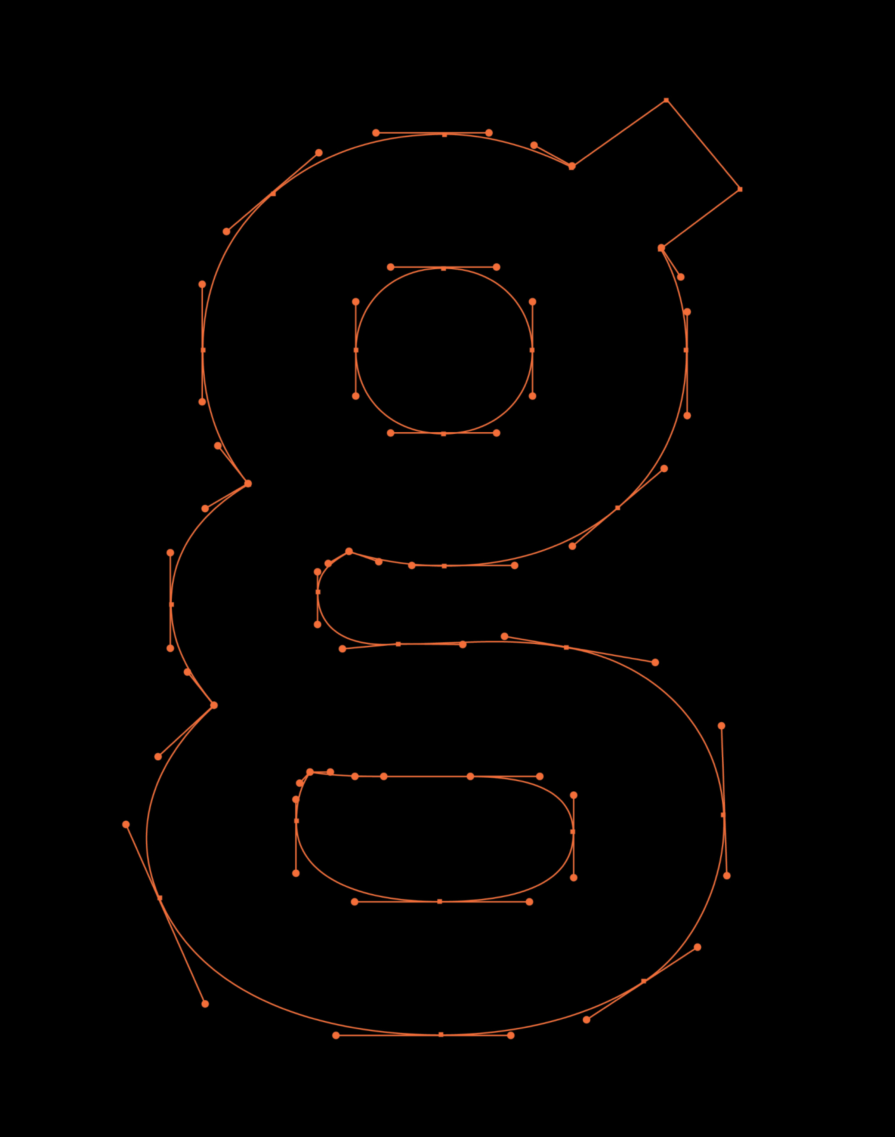
However, the spirit of the golden Labrador was not lost, with a custom drawn ‘g’ capturing the affable nature of our canine friends. Small nuances such as the letterform's bouncy construction and a small, playful ear imbue personality into the overall brandmark. This typographic detail also served a greater function, ensuring the brandmark achieved optimal legibility at small sizes through its unique double-storey construction.
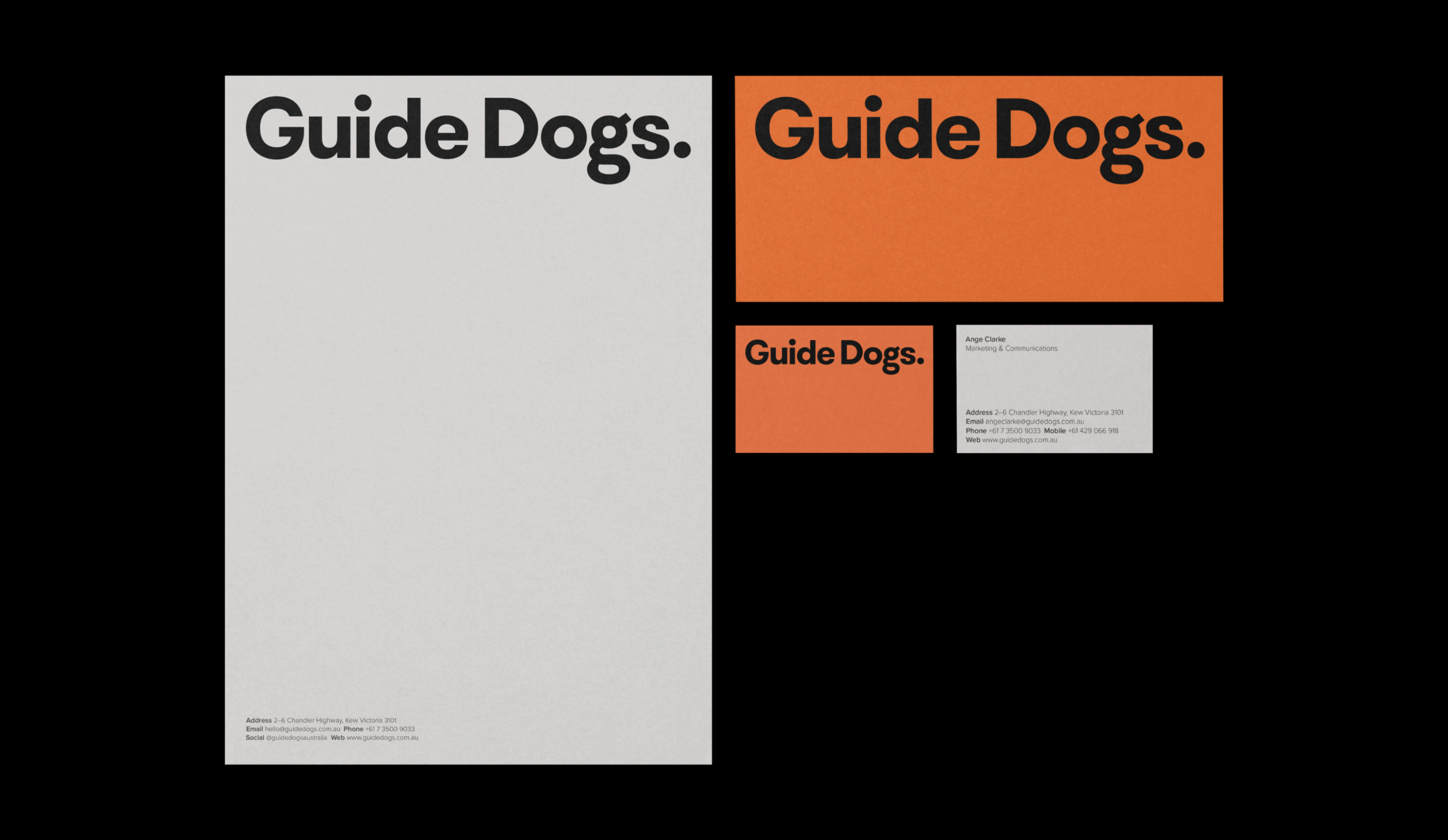
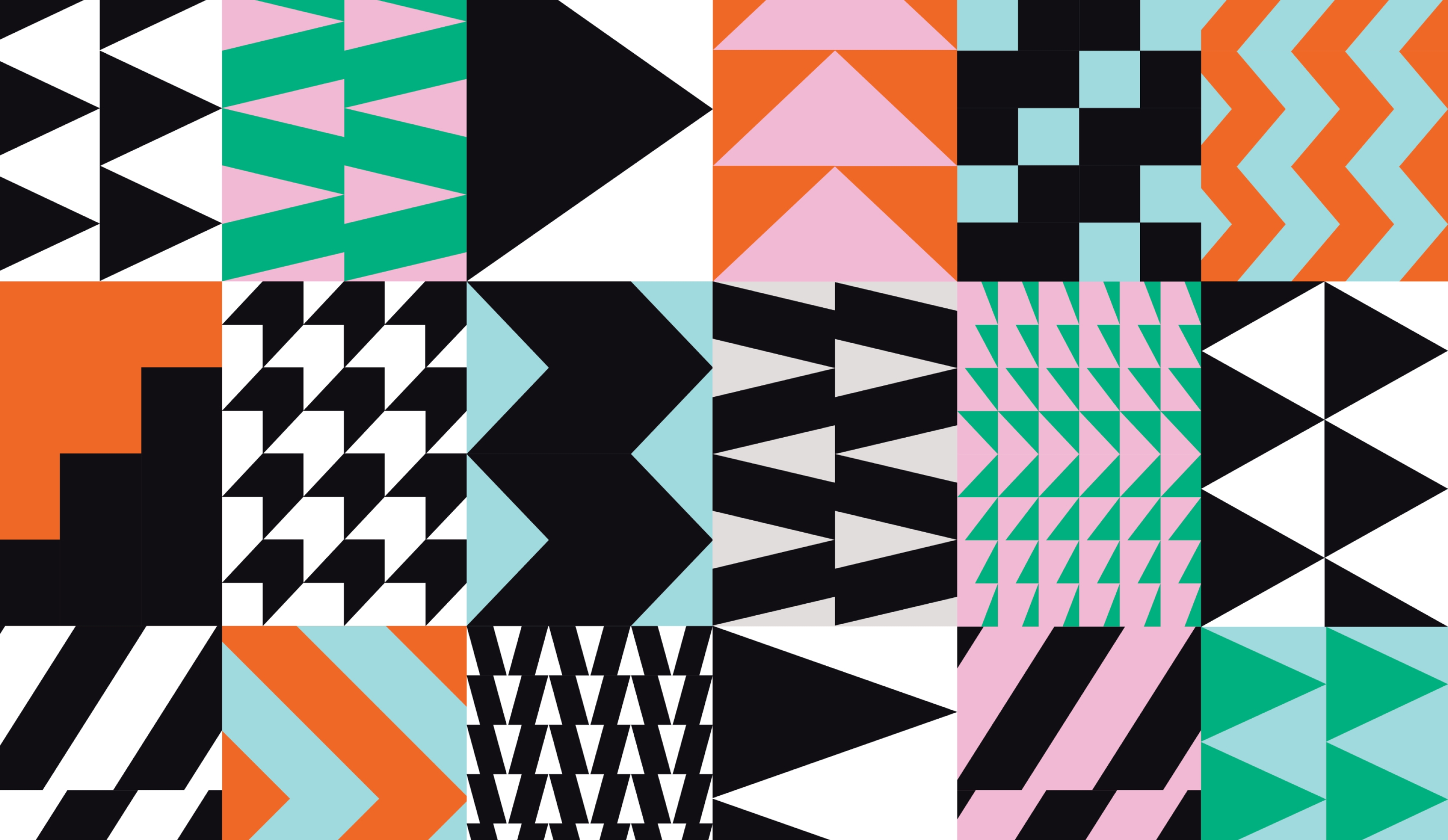
The Guide Dogs colour palette was developed around a core set of soothing and optimistic colours. When combined with charcoal and white, these colours provide optimal contrast and legibility across all branded touchpoints.
It was crucial that the Guide Dogs colour palette struck the right balance of being emotive yet practical. We achieved this by priortising accessibility when selecting colour early on in our design process. This ensured the end outcome was an inclusive brand made for and consumable by all people.
A series of bold patterns were developed for use across brand touchpoints. Through repetition and movement, these patterns act as a guiding device, helping to articulate the idea of finding your way through the world, whilst giving the brand expression distinction and energy.