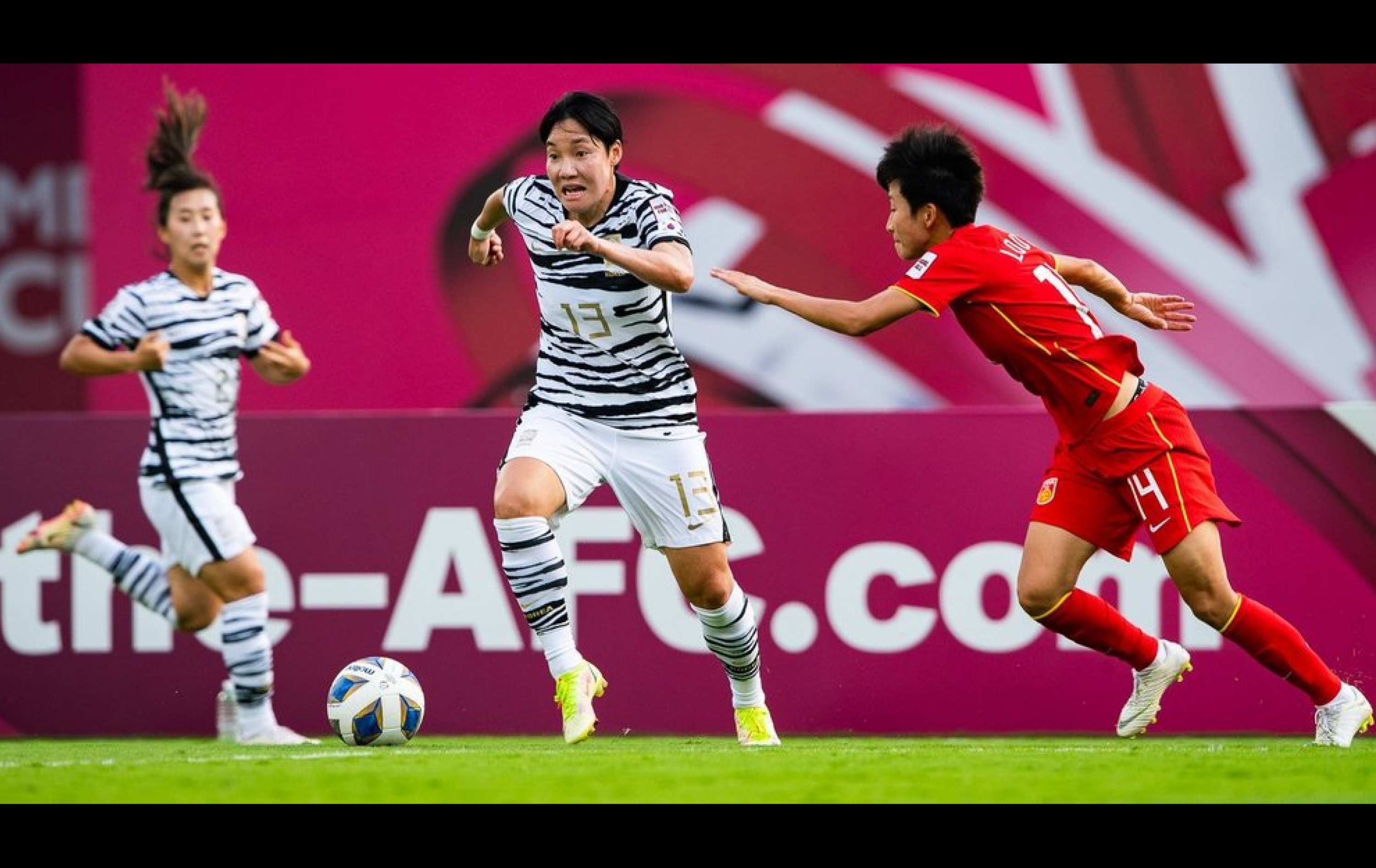
Football is also a huge passion point in Asia, contrary to common perception. Asia has become the centre of football fan power and all indicators point to its growing potential. In fact, 1 in 2 football fans around the world live in Asia. There are more fanatics in China (238m) than in France, Germany, Italy, Spain and the UK combined (131m).
The Asian Football Confederation is the governing body for football in Asia, comprising 47 member associations from Beirut to Brisbane.
- Entertainment & Sport
Sectors
- Brand Strategy
- Brand Architecture
- Stakeholder Engagement
- Brand Identity
- Brand Language
Services


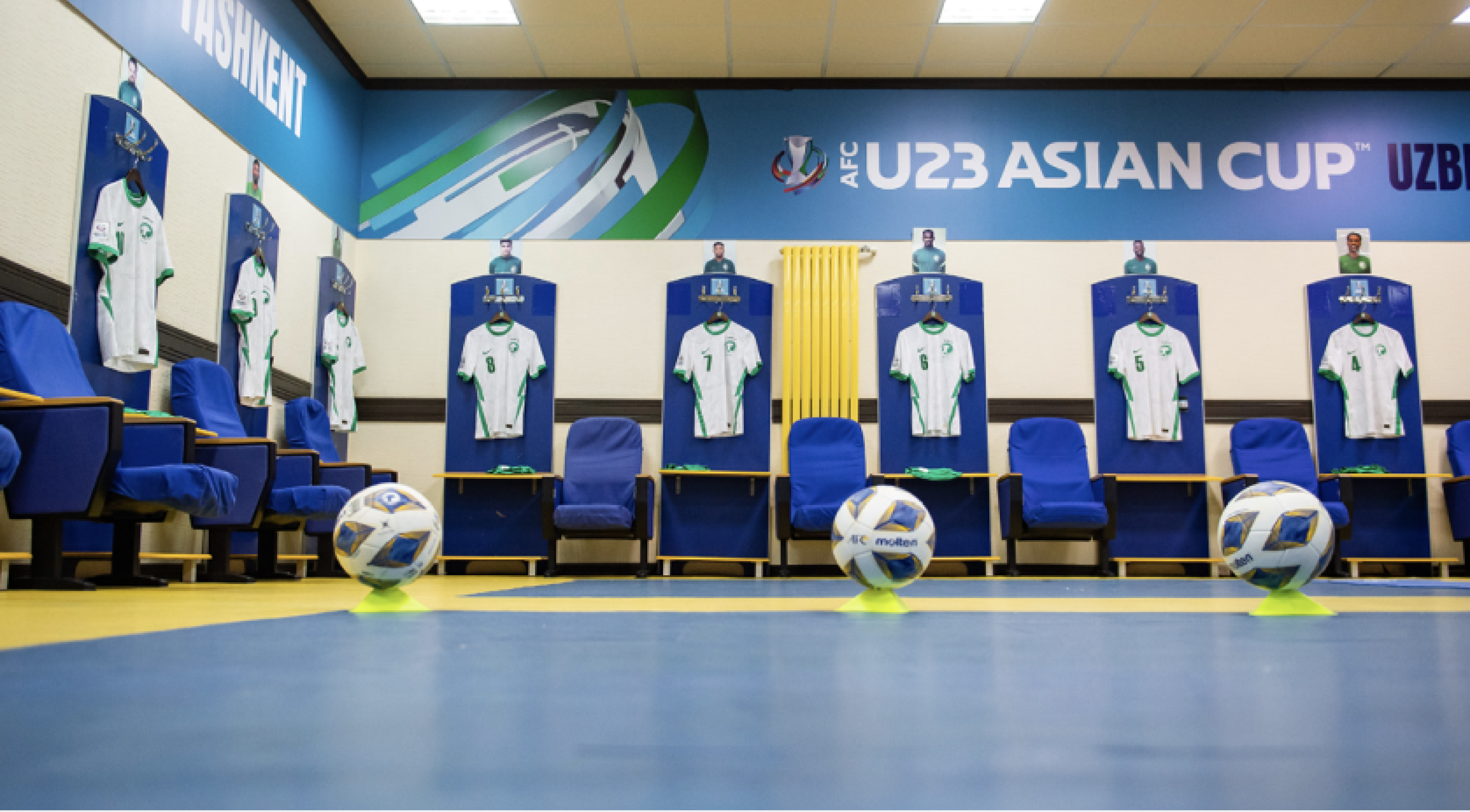
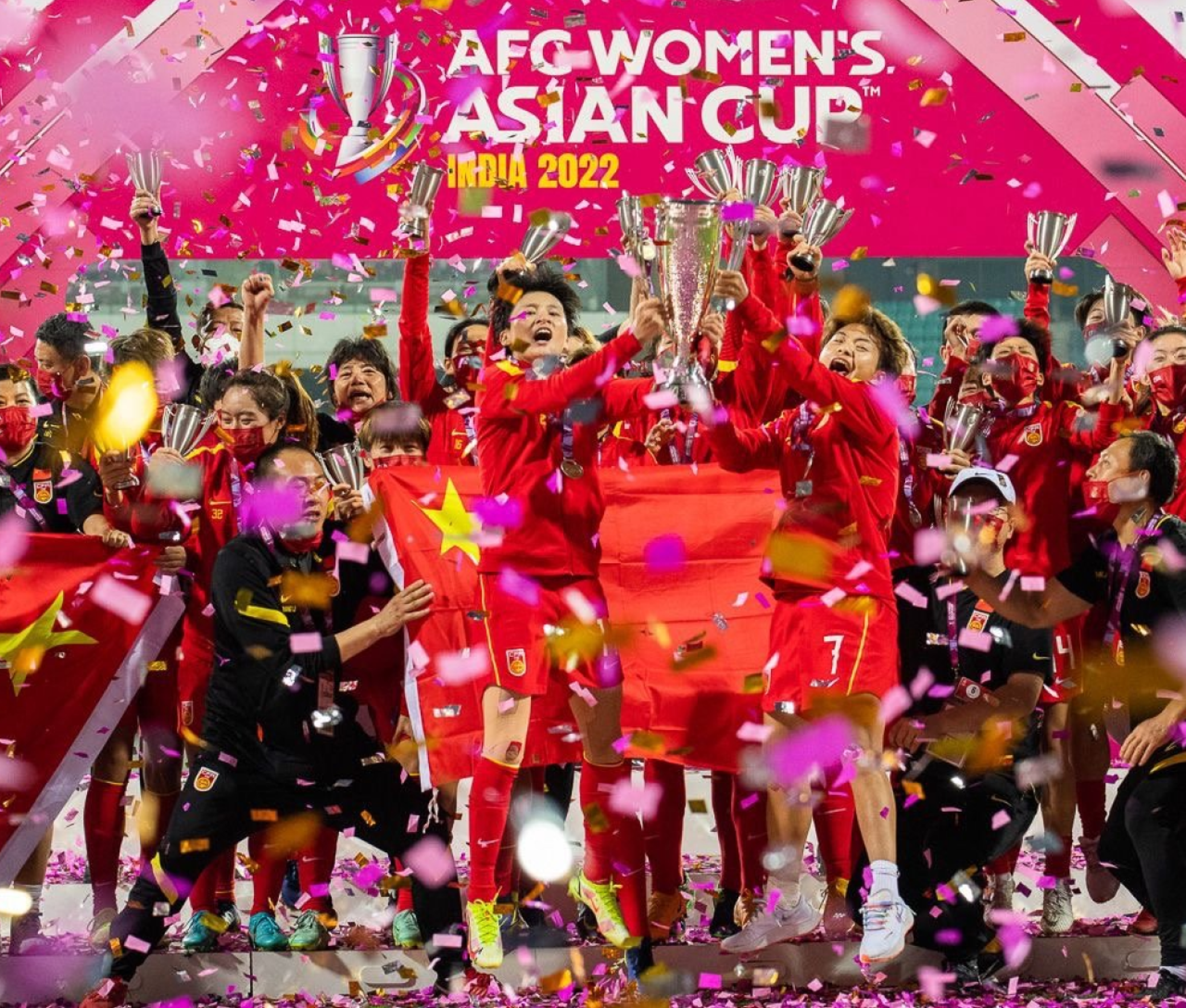
Our brief from the Asian Football Confederation (AFC) and Football Marketing Asia (FMA) was to create a branding ecosystem and connected portfolio of compelling brand identities for major AFC men’s, women’s and youth competitions that would elevate these competitions onto the world-stage while incorporating distinct and uniquely Asian characteristics, enticing fans to connect more deeply with AFC football.

Historically, a lack of clarity and consistency meant that the competitions’ full potential and market value could not be realised. We created a branding ecosystem comprising individual brand identities for AFC competitions of a connected portfolio, that would tell a uniquely Asian football story and present visually compelling experiences to the fans.

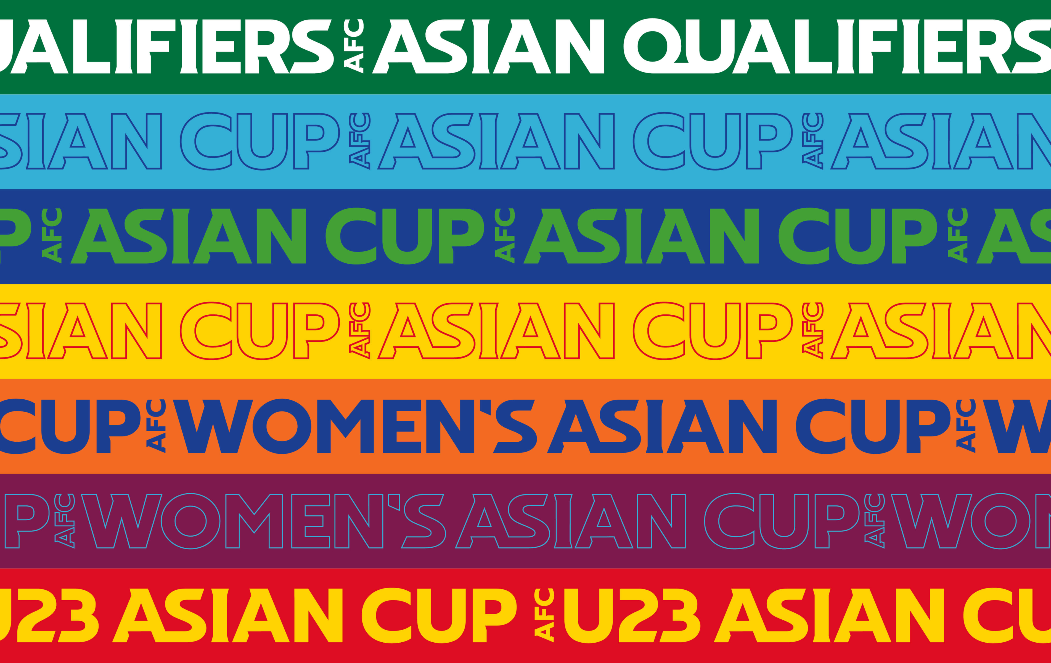
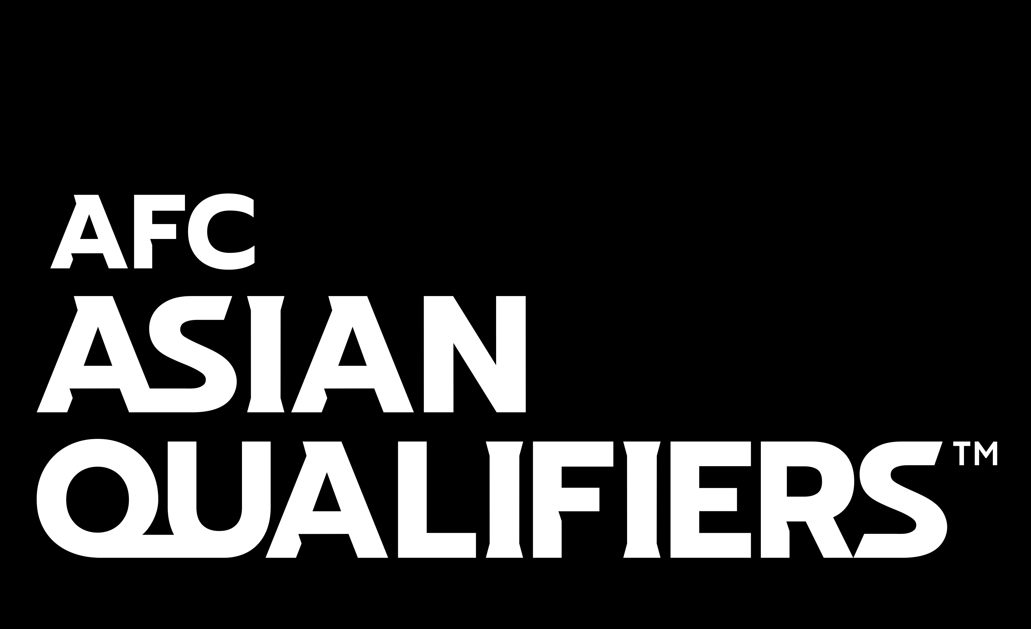
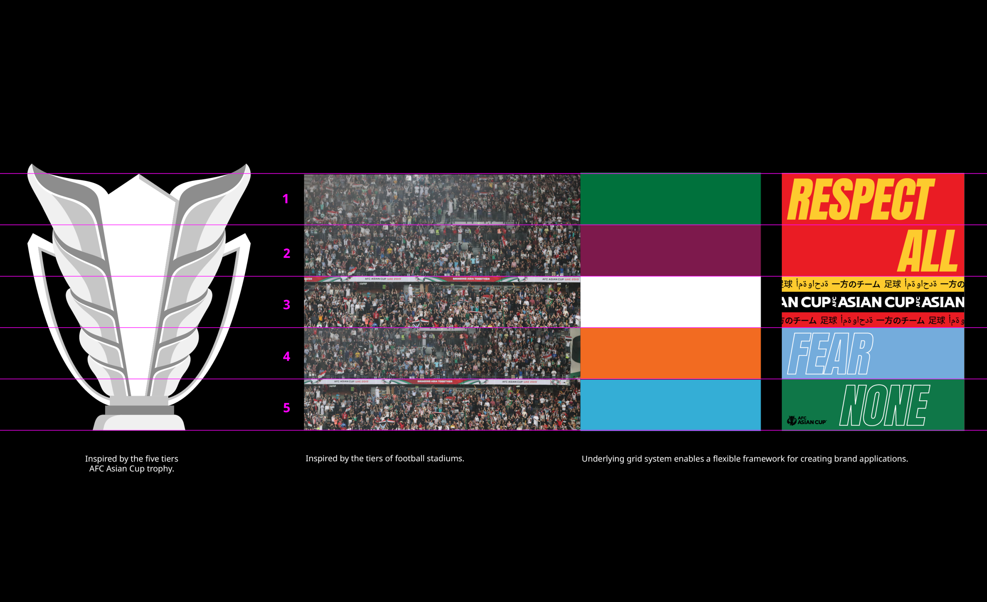
After organising the various competitions into clear but connected ‘verticals’, we created a red thread in the form of a bespoke wordmark as a universal element across all ‘verticals’ – a singular but versatile typographic treatment combined with consistent competition name hierarchy (name, font, size). Complementary symbols were enhanced by redrawing them to become a family of assets – each can be used as its own graphic shape to add visual interest to everything from billboards to broadcast.
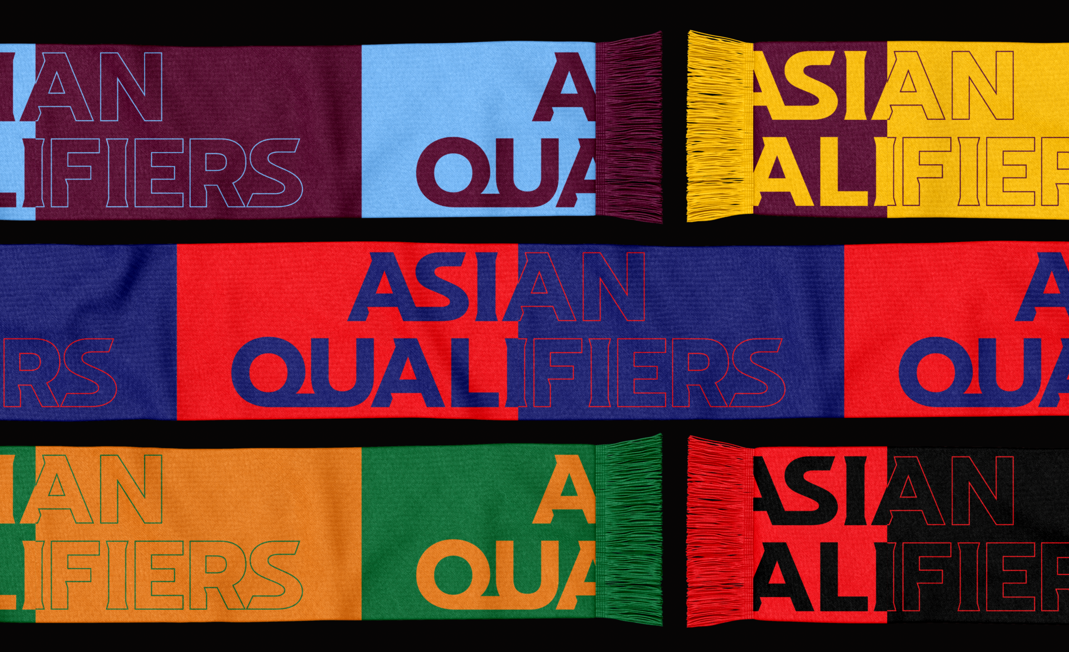


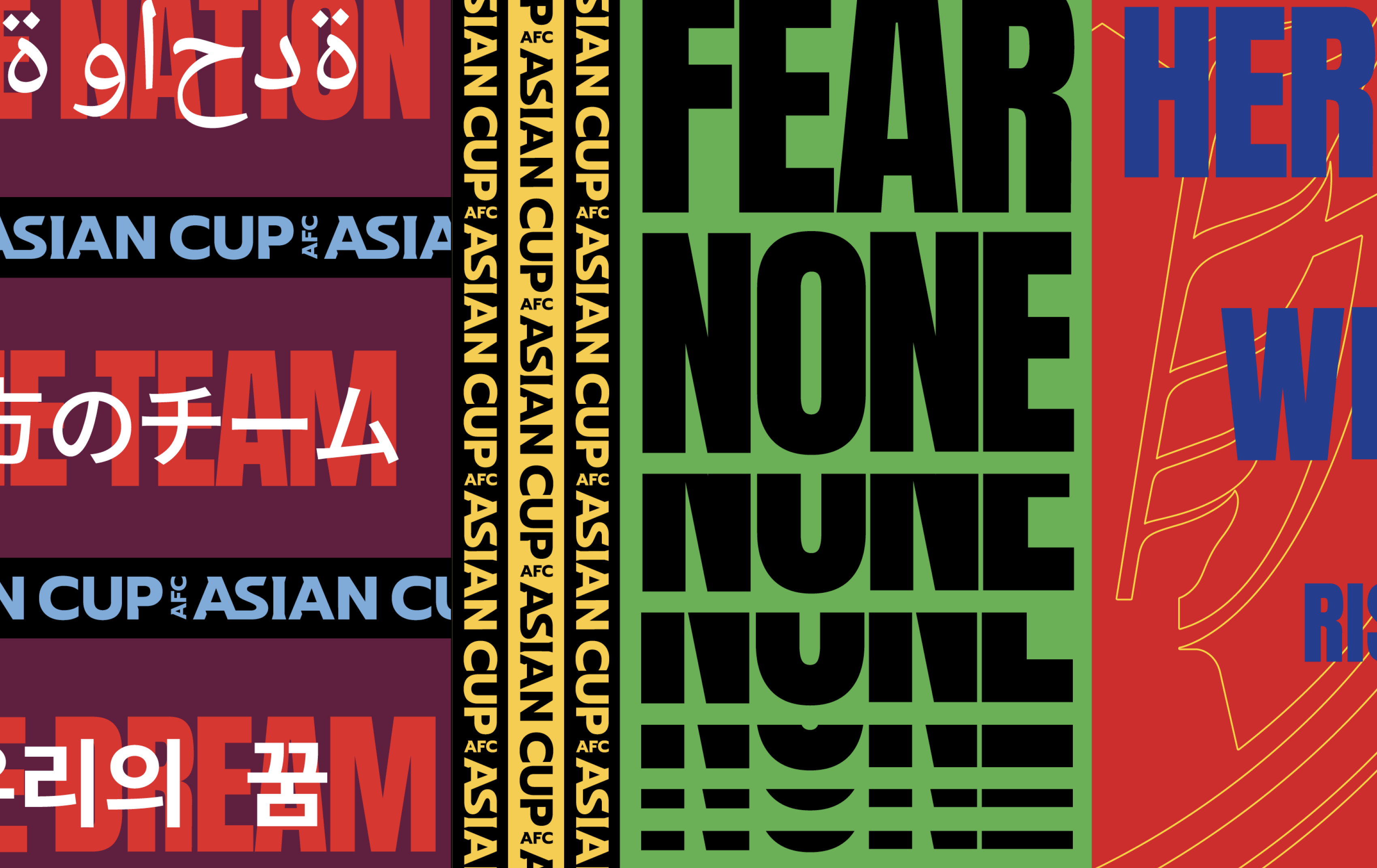
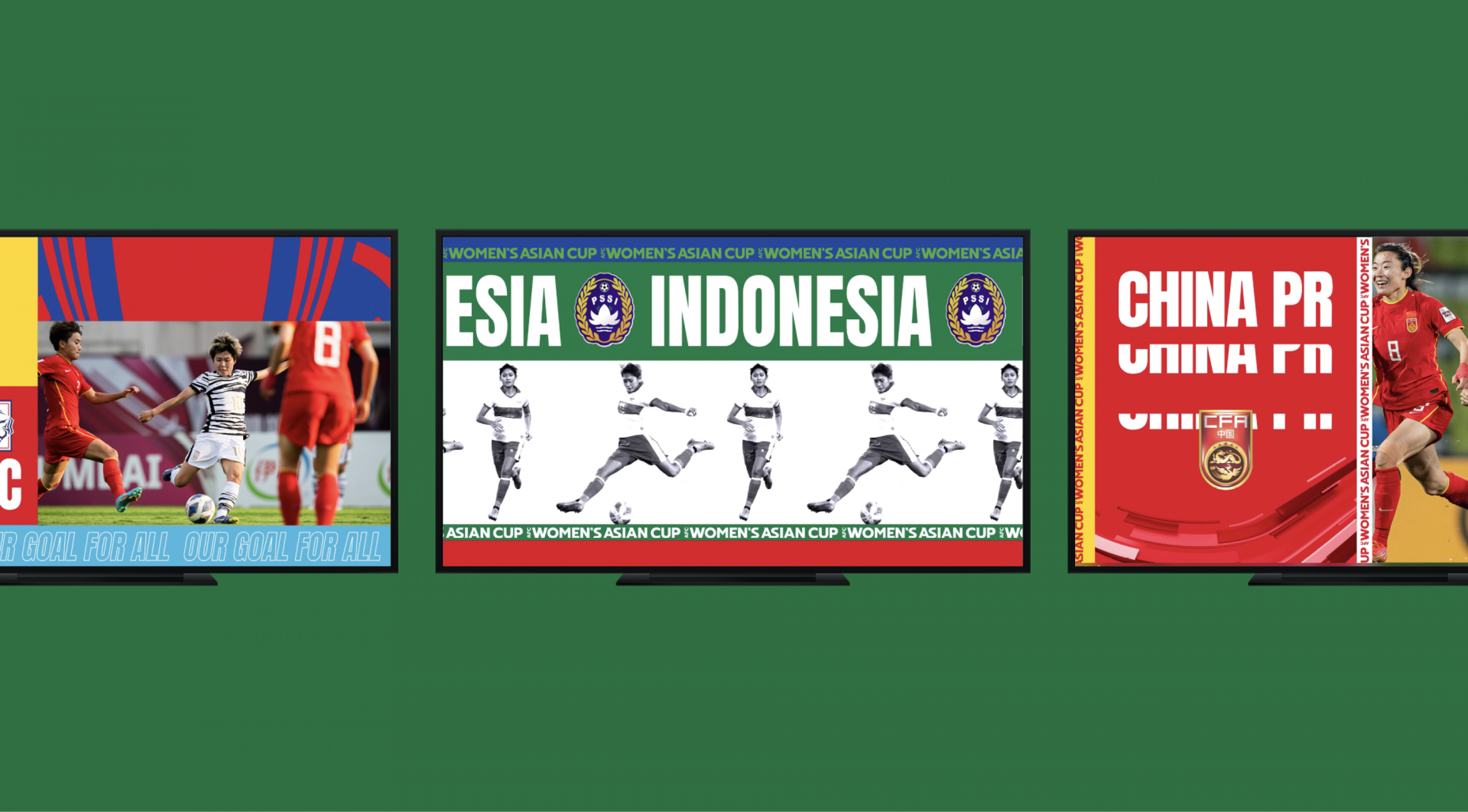
We selected typography such as Anton for primary typeface to mirror the strong energy of the competition brand and complement the brandmarks. We embraced the AFC’s rich diversity with a multi-lingual approach to our brand applications, using Noto Sans’s 800+ different languages to ensure fans can enjoy content in their native language.
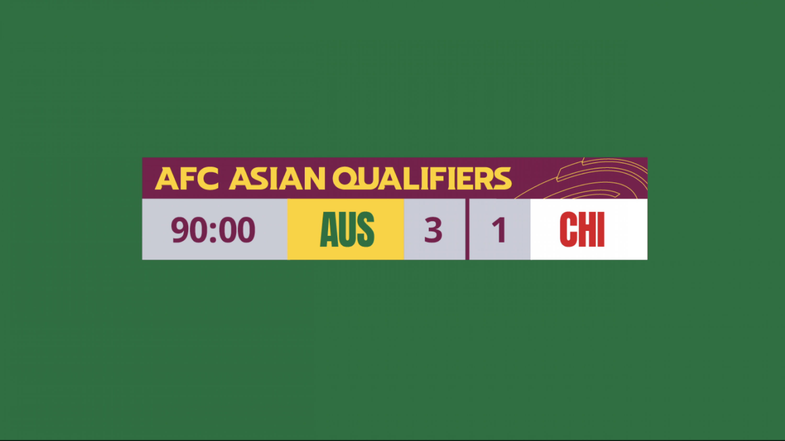
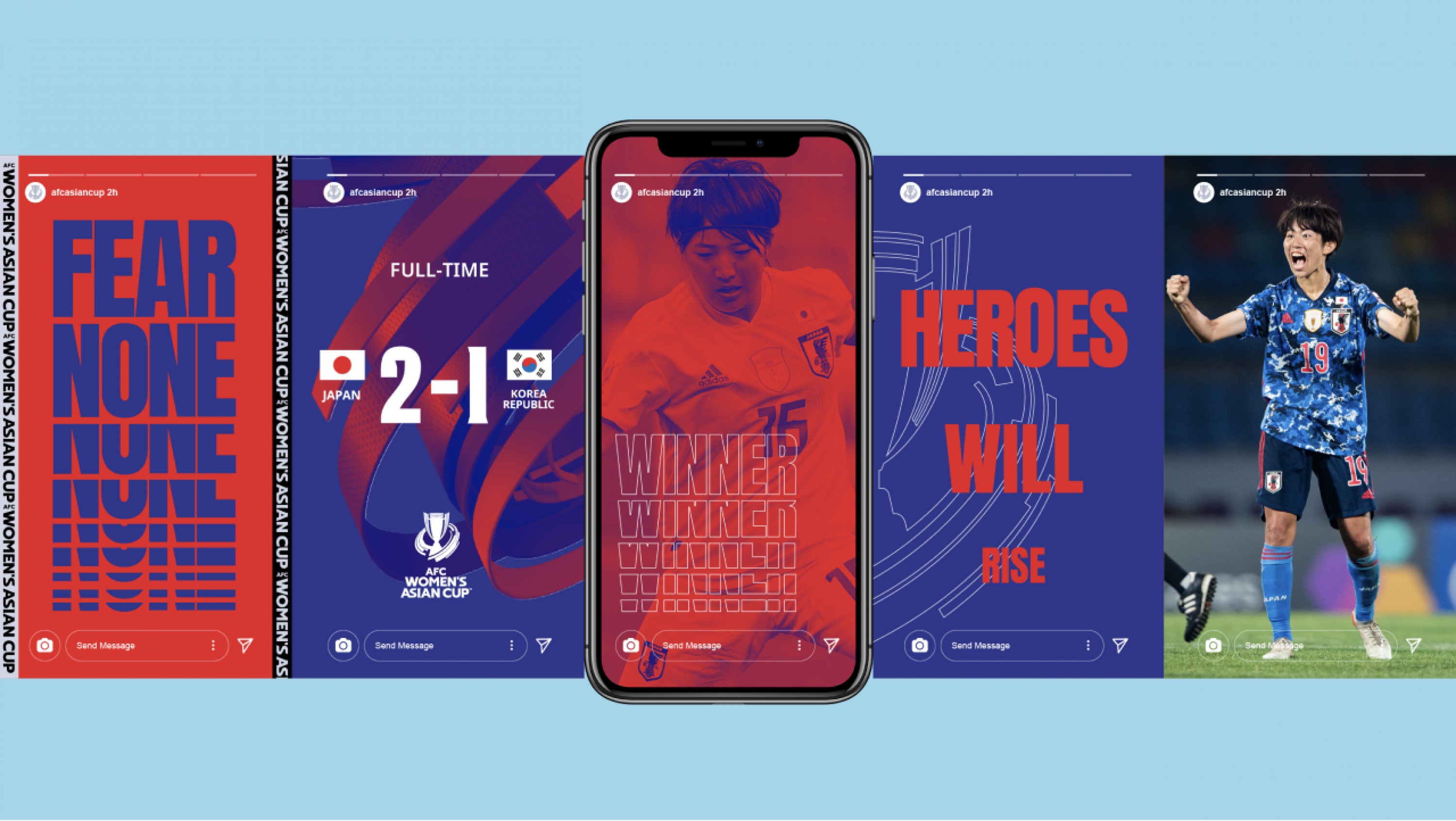
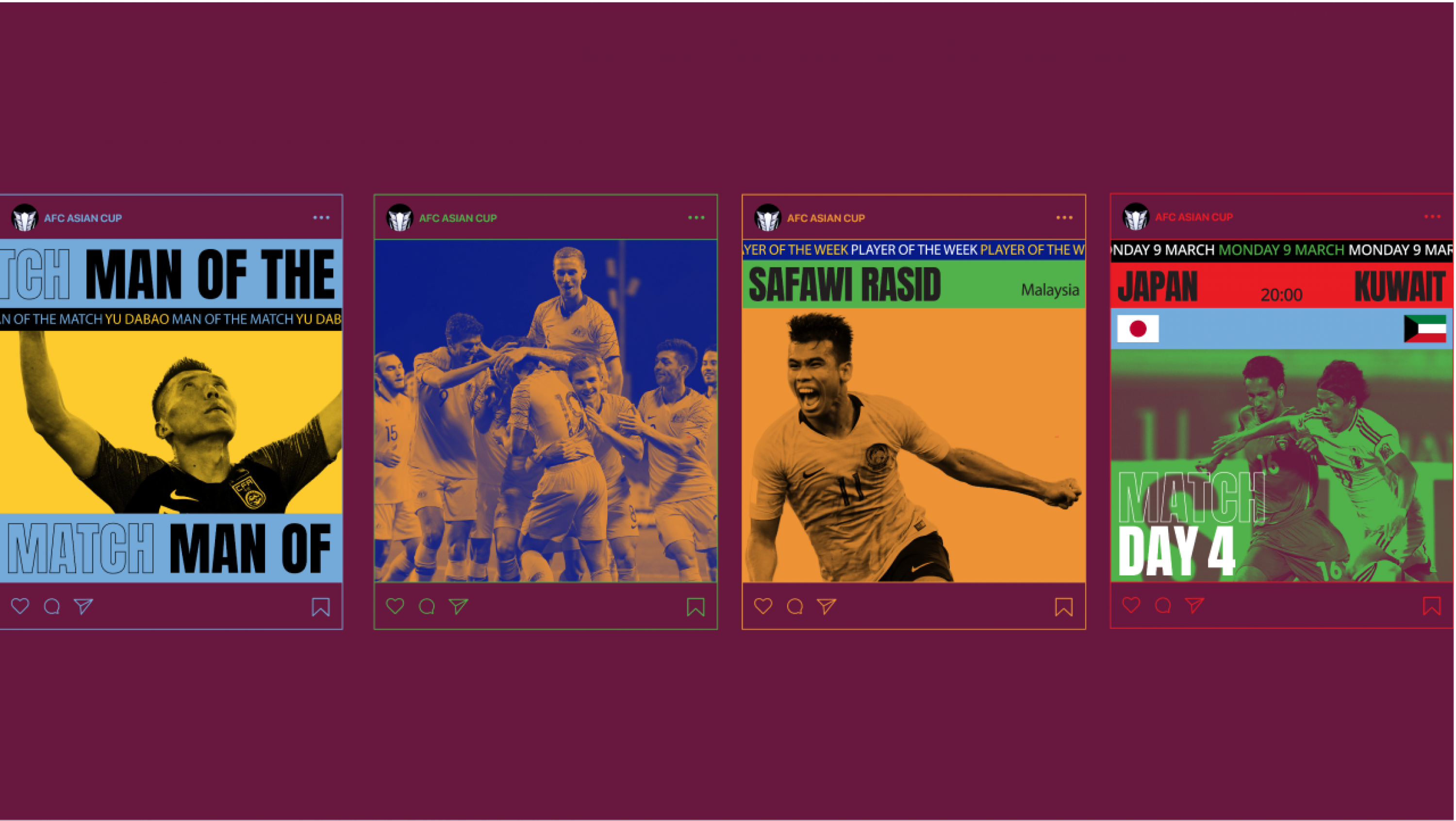
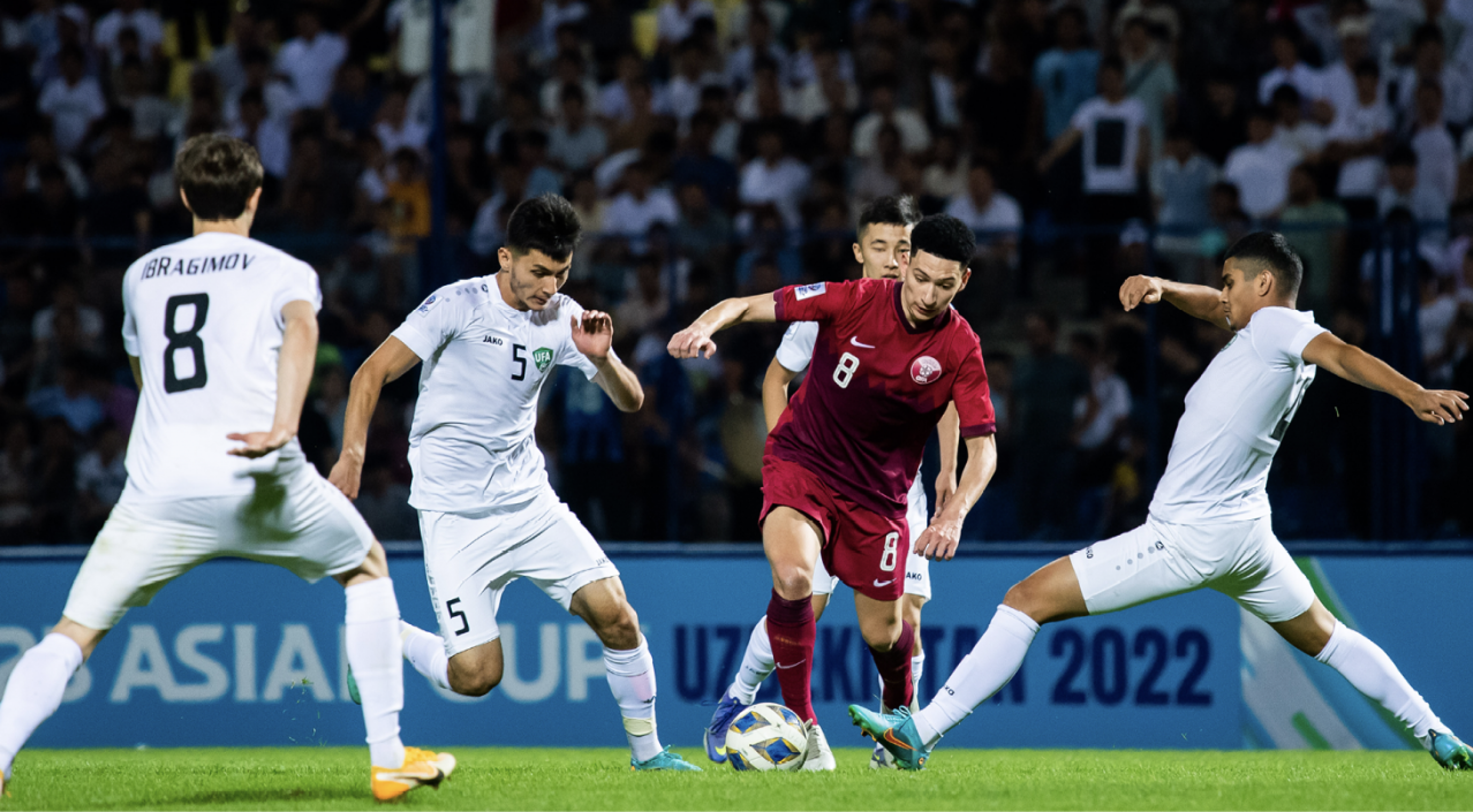
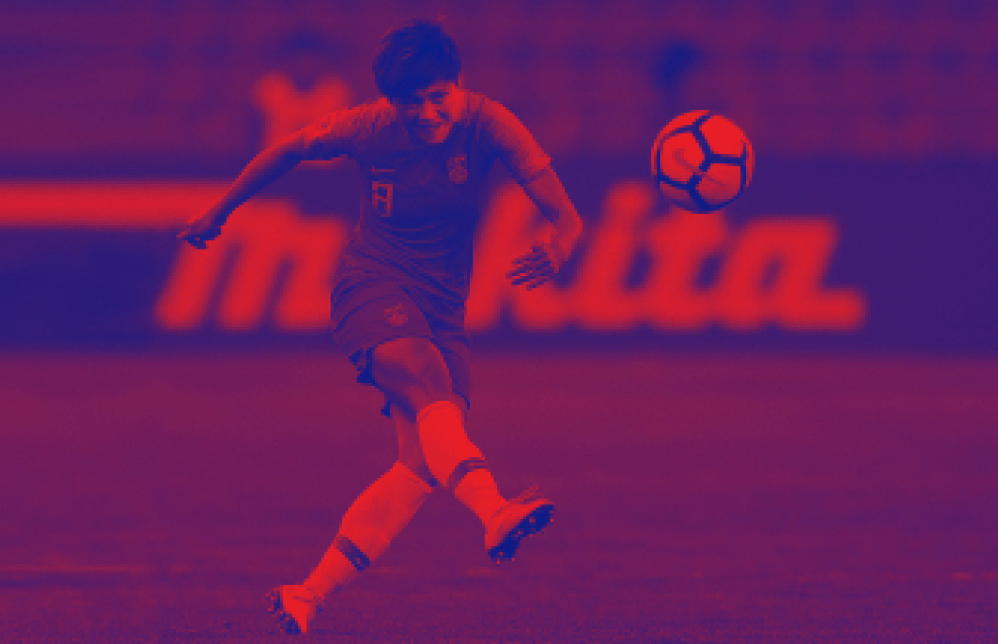
The visual identity system is inspired by football stadiums, embracing the biggest, most vibrant arenas where Asia's fans come together and champions are crowned. The dynamic grid framework organises all visuals and typographic elements effectively and with clarity. The duotone photography creates a refreshingly bold and graphic look and feel that leverages AFC’s existing and extensive photographic libraries. The entire visual identity system is fully flexible to enable the identity to adapt to the host nation from one cycle to the next – and still maintain branding consistency for cumulative effect.