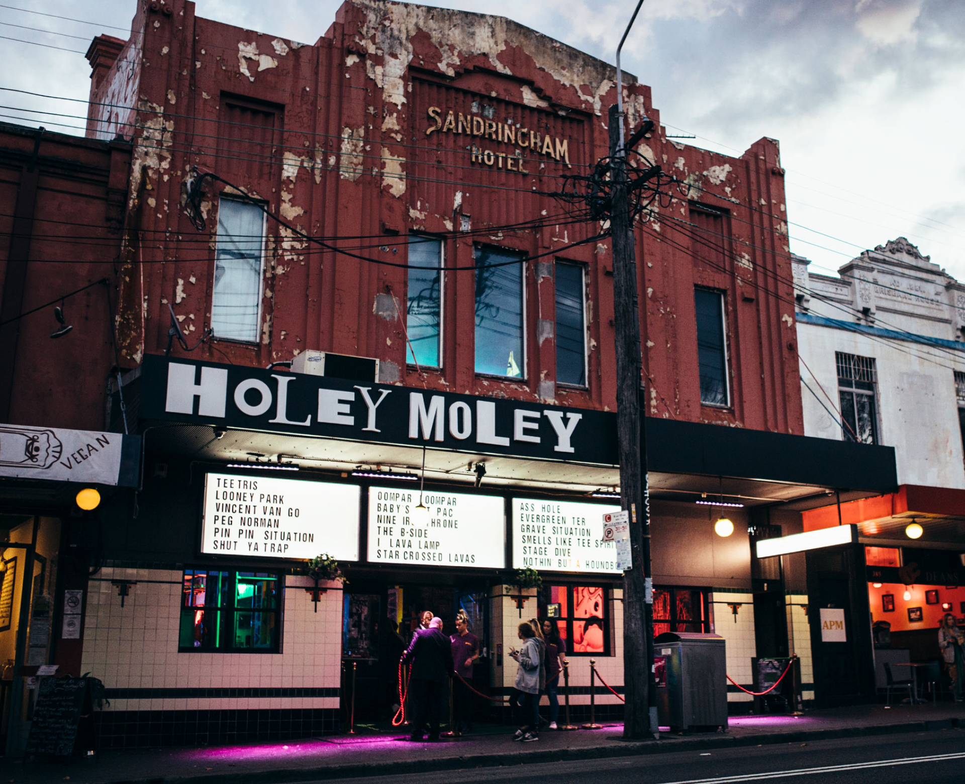
Funlab is a close-knit family of eight entertainment brands – 38 venues and rapidly growing – delivering their unique spin on fun experienced across bowling, arcade games, mini-golf, karaoke, escape rooms, challenge rooms and virtual darts.
We worked with Funlab to identify their uniqueness and that was the ability to embrace alchemy to create weird and wonderful experiences that transmogrify the ordinary into the extraordinary. And when we applied that to our brand’s look and feel, something revealed itself. It was pure magic.
- Entertainment & Sport
Sectors
- Brand Strategy
- Brand Architecture
- Stakeholder Engagement
- Brand Identity
- Brand Language
- Customer Experience
- Employee Experience
- Brand Management
Services


In those early years, the Funlab brand mostly played behind the scenes. But as the brand keeps evolving – bringing more fun, to more places – it’s clear that the brand has an even more important role to play, transforming from a corporate identifier to the driving force that imagines, creates and sustains experience brands for the world to enjoy.
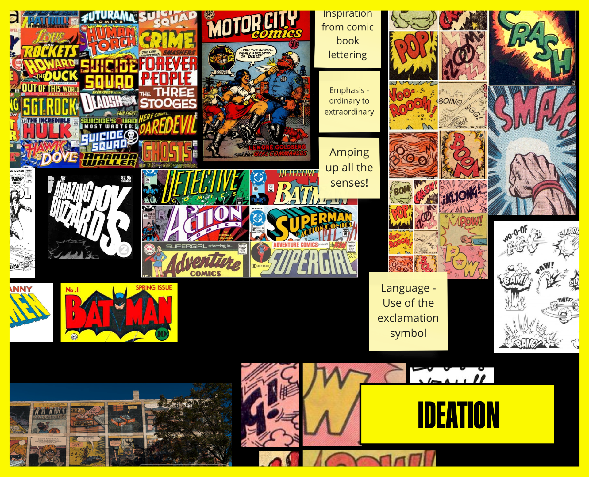
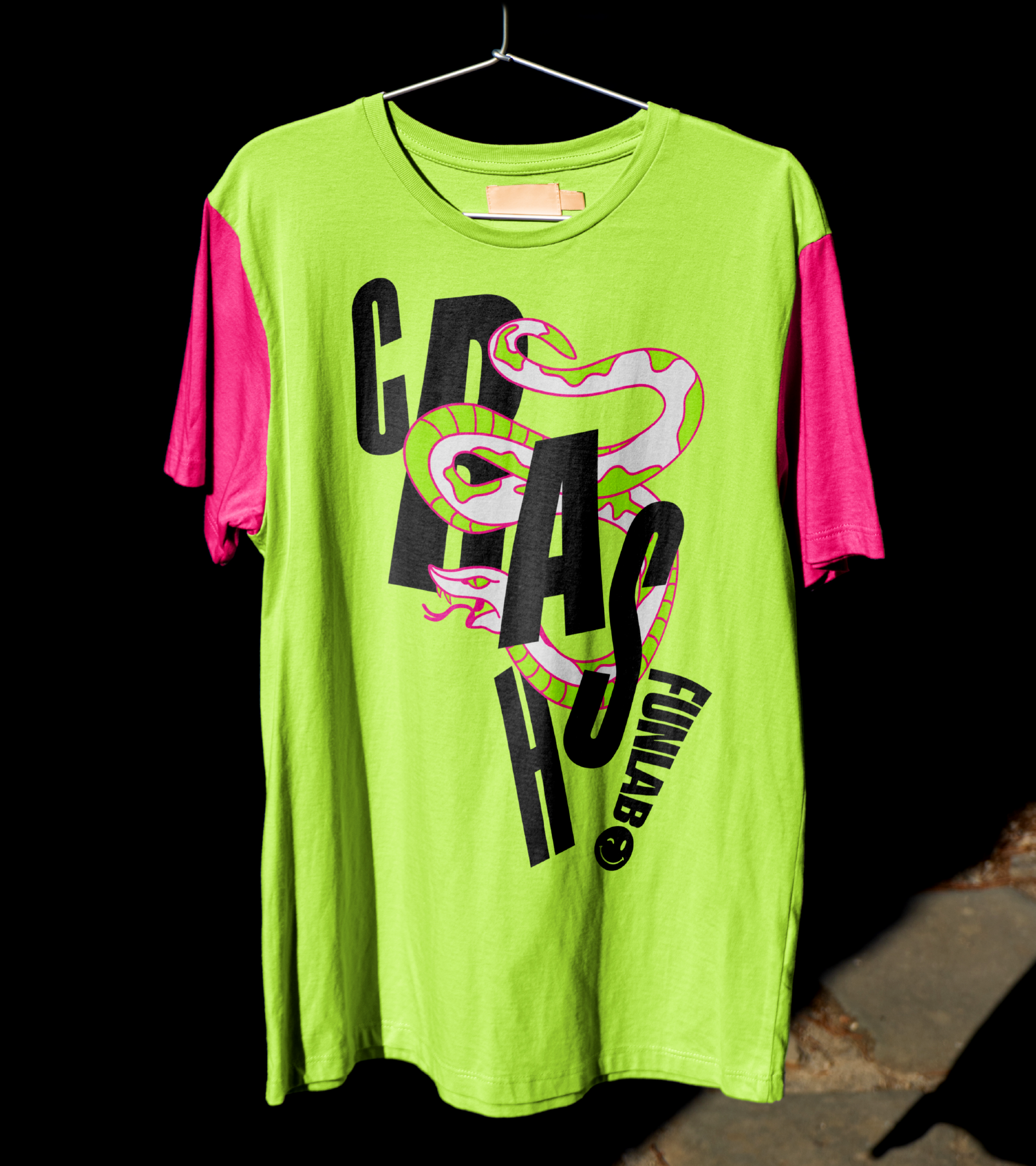
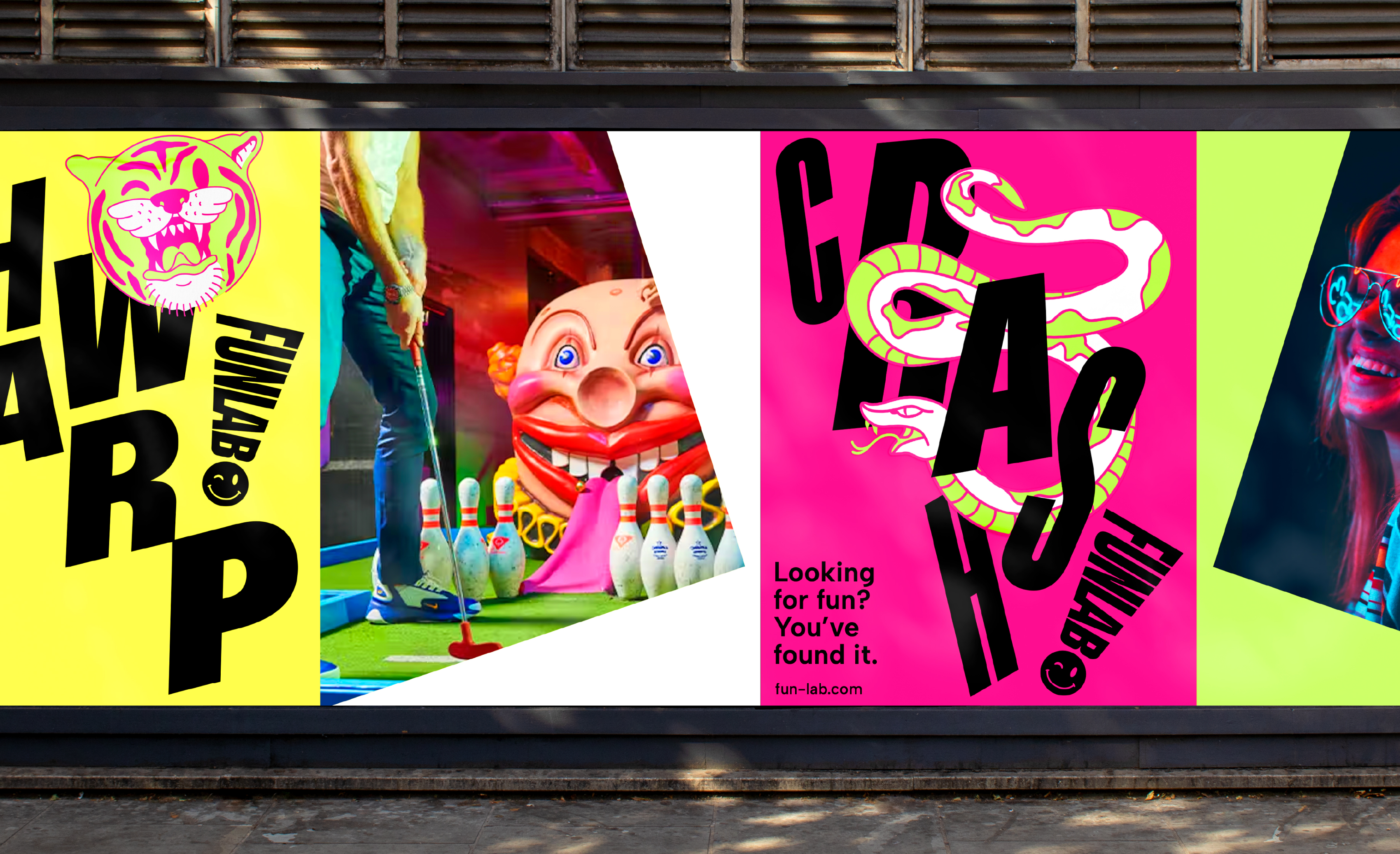
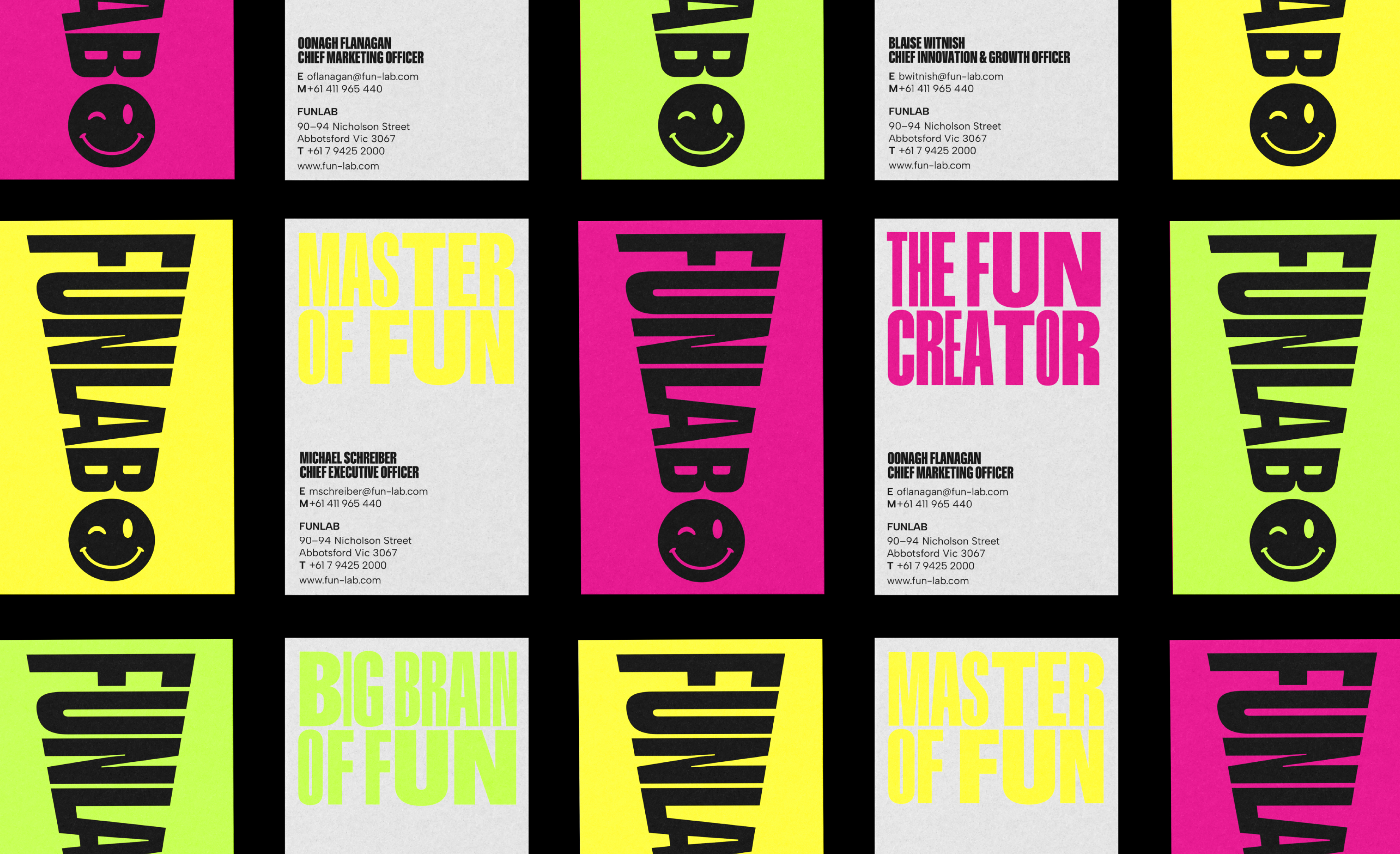
Just like the experiences Funlab creates, we crafted every element of the brand’s expression to be larger than life. To show that fun is more than a word. It’s a feeling. A way of seeing the world – and finding magic in it. Tapping into a heady mix of nostalgia and novelty, we drew inspiration from colourful comic books, where words and exclamation marks punctuate pages to capture a sense of action.

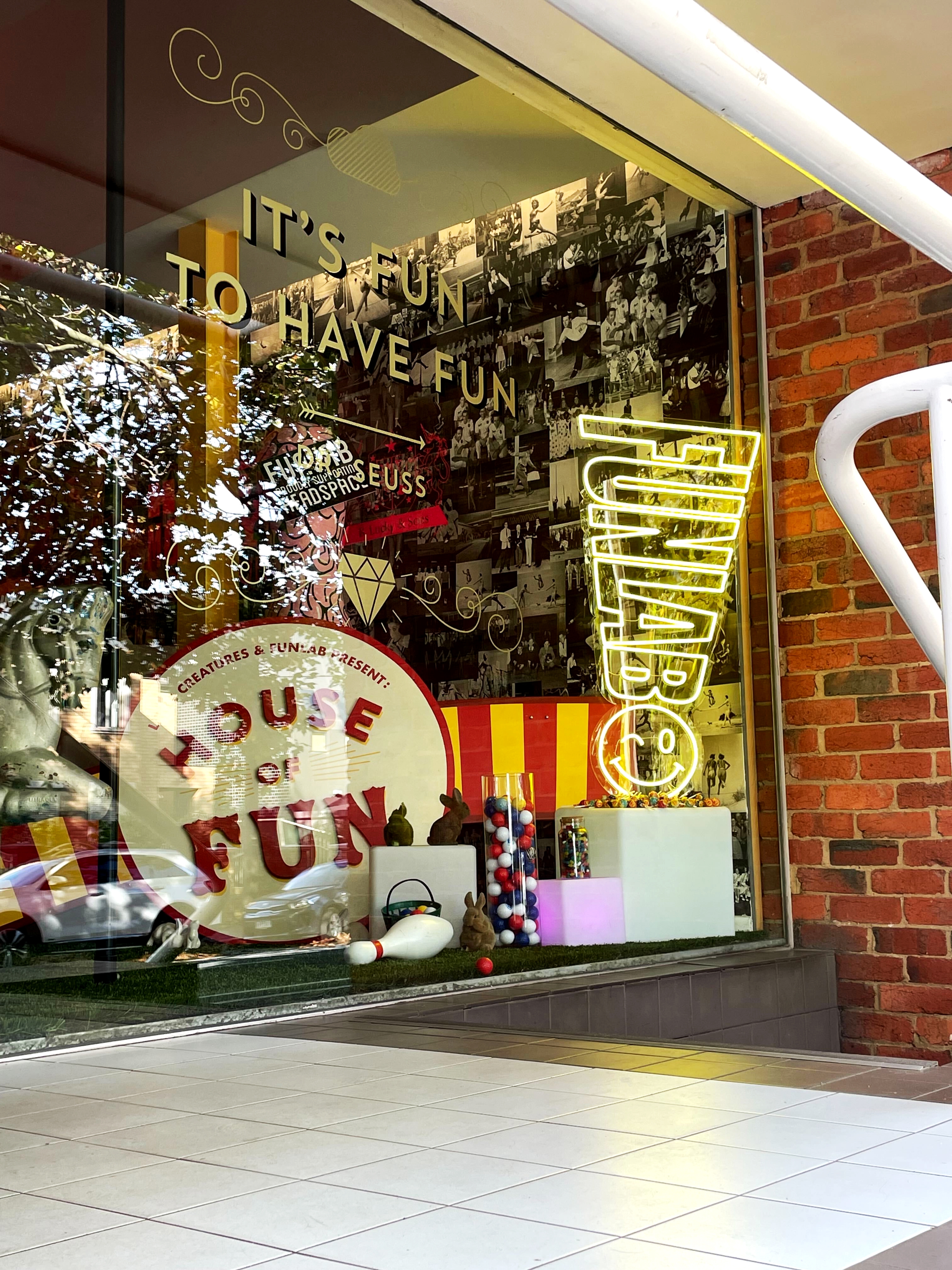
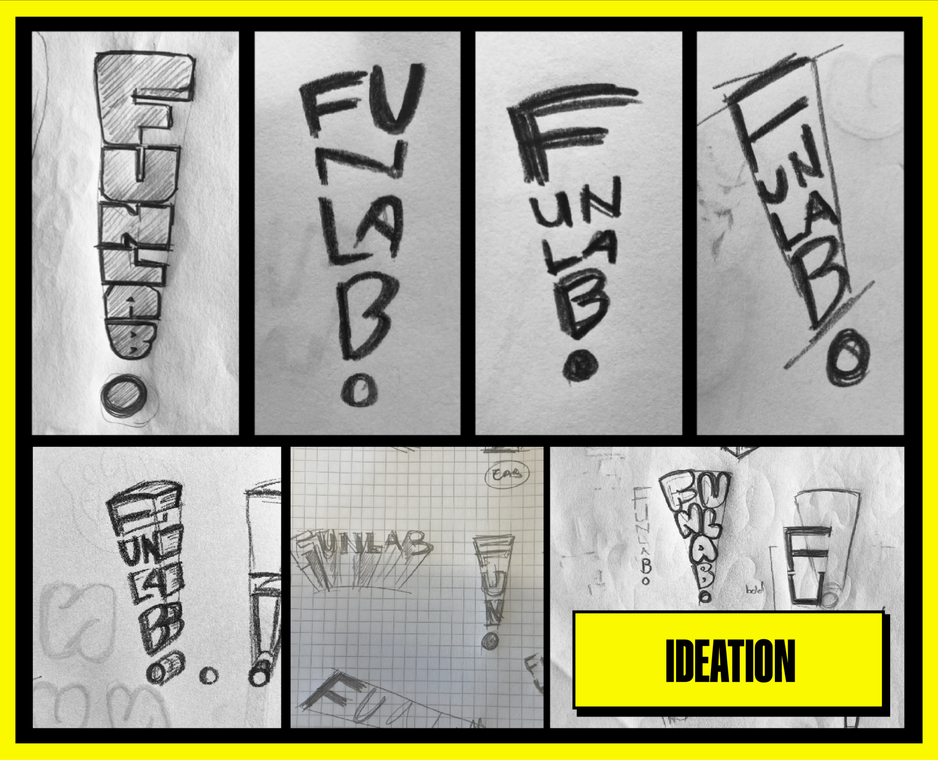
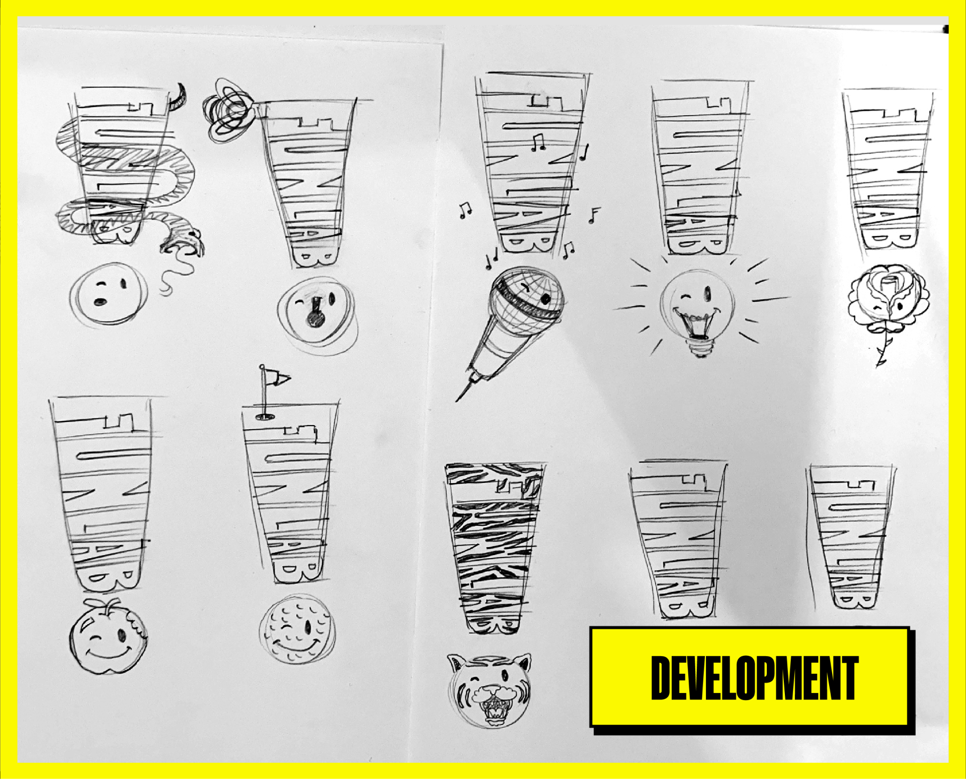
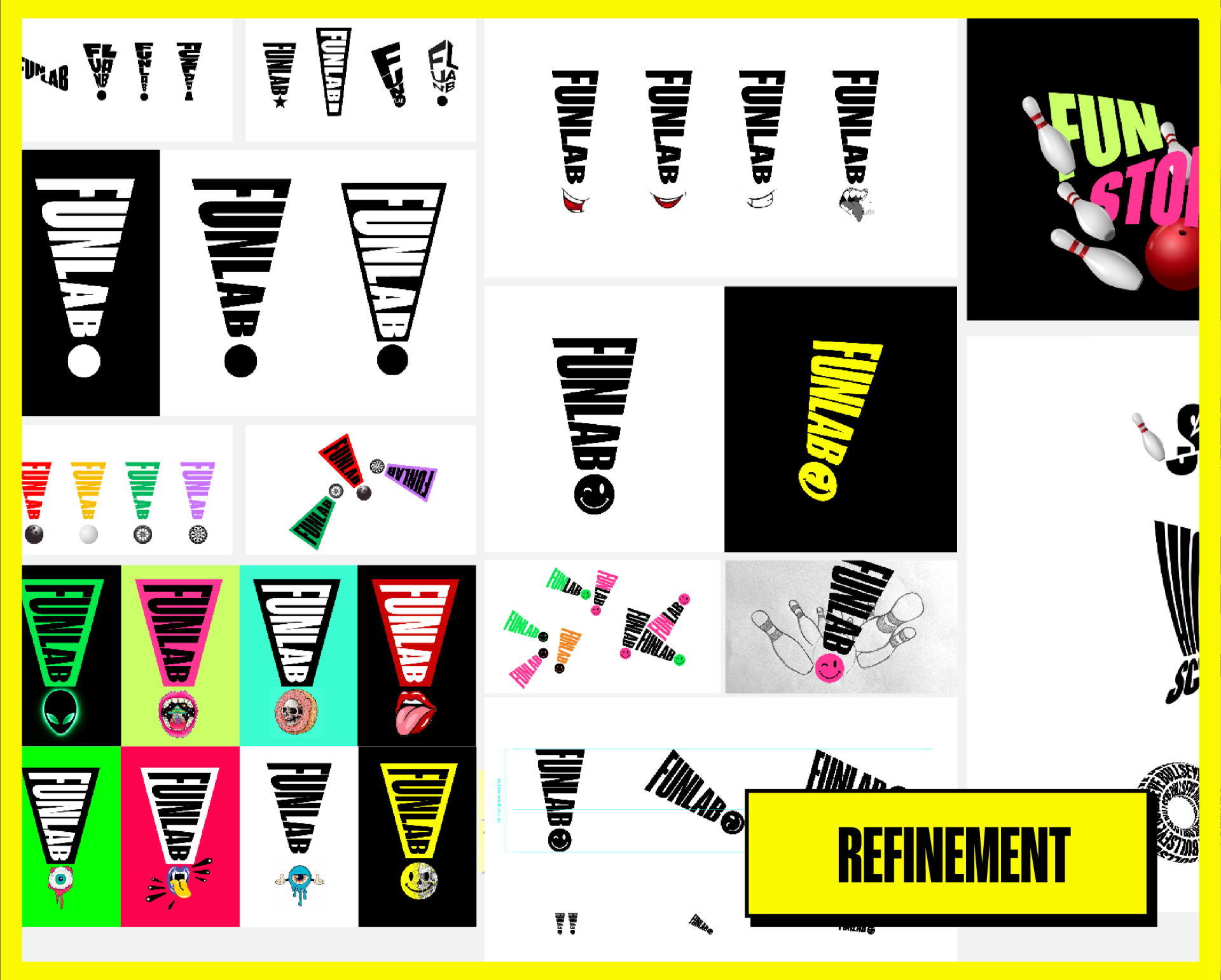
Funlab has never been constrained by convention, let alone bound by the rules. Taking on the form, energy and emotion of the exclamation mark, we designed Funlab’s brandmark as a cheeky nod to encourage audiences to suspend their disbelief.
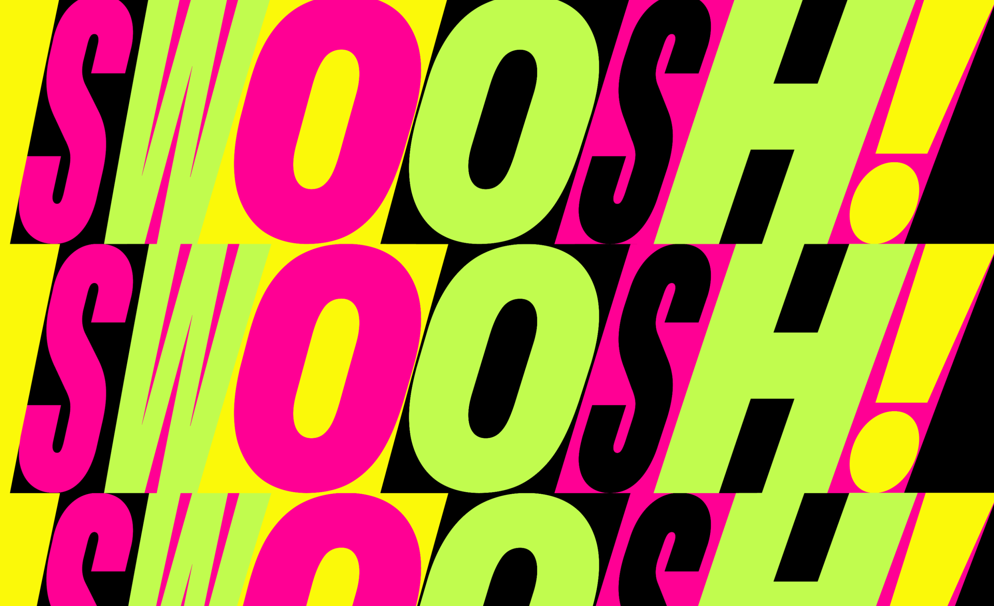
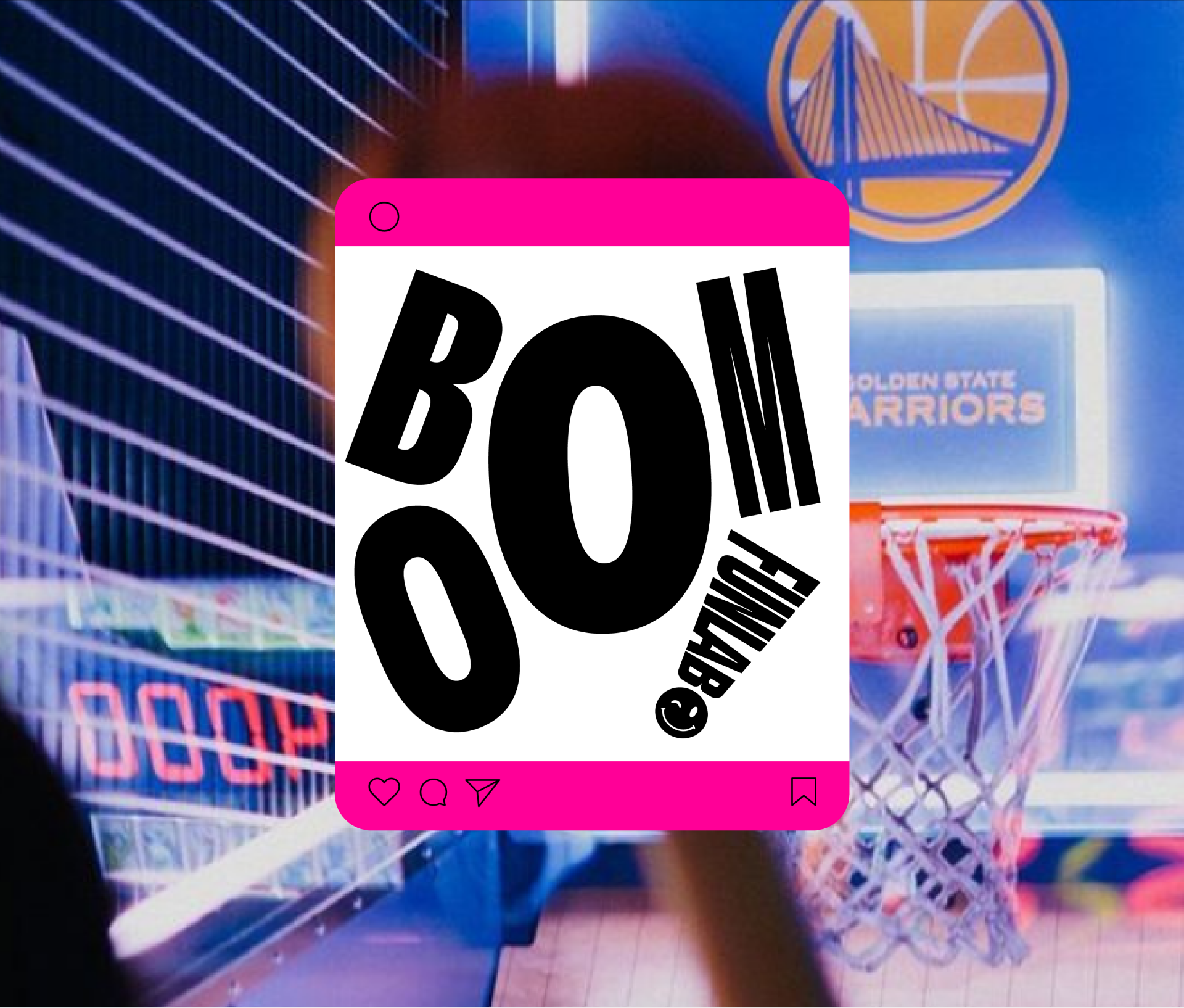
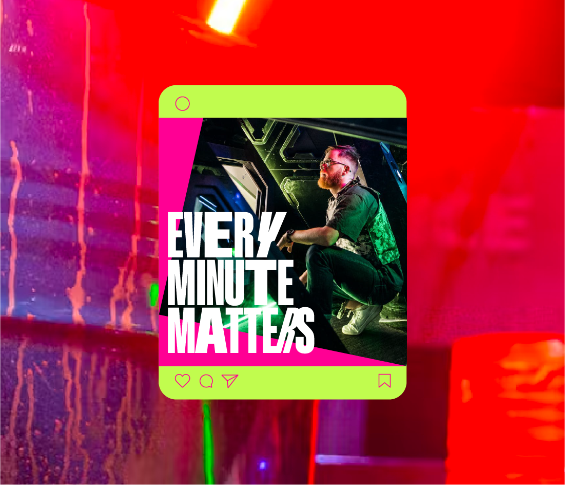
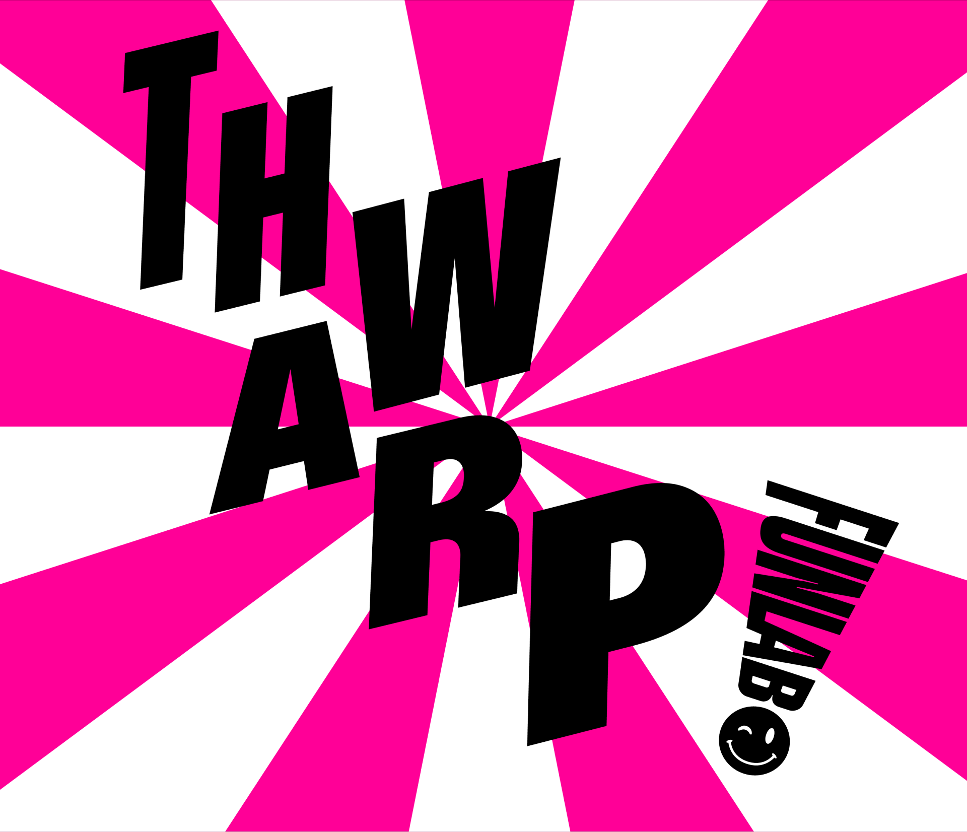
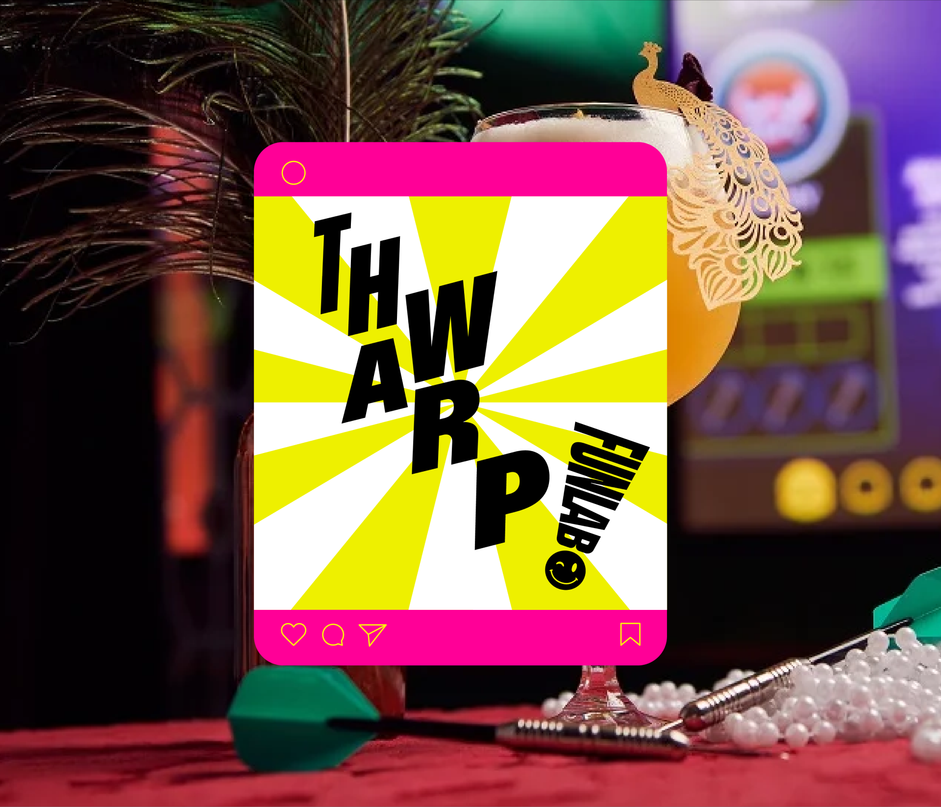
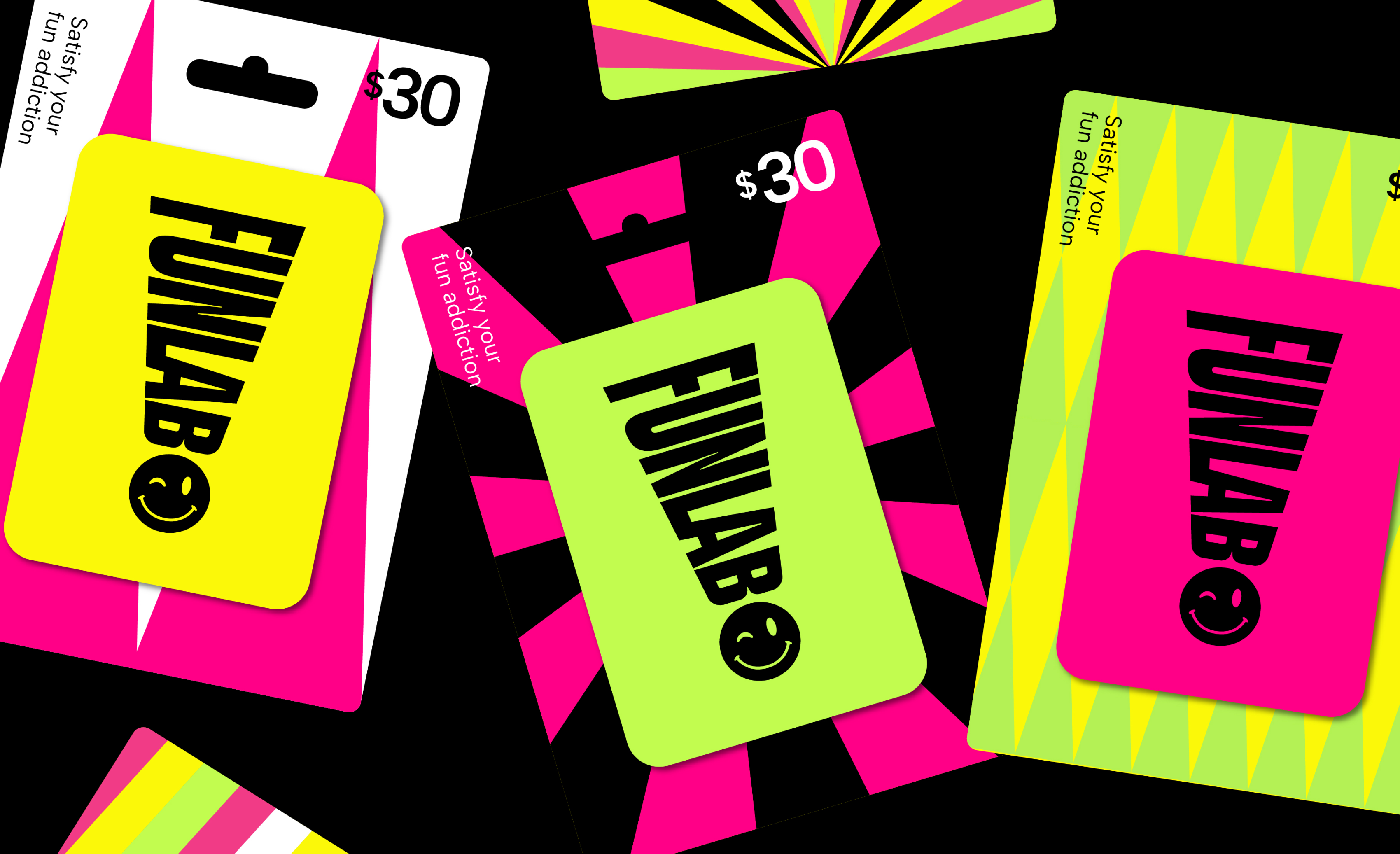
The brand’s look and feel reveal an unexpected palette of neon lime, pink and yellow vibrantly pop against a refined duo of black and white. A series of shapes shift from one exciting point to another, forming a framework of flexible and functional patterns. A bold new typeface – Gravity – gives words the confidence to burst to life to make themselves heard.