Following an ambitious strategy to double the Vocus business by 2023, there was a critical need to reset and recharge the brand, ready for transformation. Operating amidst ever-shifting technology, and customer and competitor dynamics, Vocus needed a brand that would enable them to stand for something meaningful in the market with a commitment to making things better, simpler and easier for customers, and to leverage a DNA that means they continually challenge, disrupt, see and do things differently.
- Technology
Sectors
- Brand Strategy
- Brand Architecture
- Stakeholder Engagement
- Brand Identity
- Brand Language
- Customer Experience
- Brand Management
Services

The business had been held back by a brand that stood for very little. With customers looking for change, Vocus understood this was their opportunity to position themselves as a welcome alternative.
With expertise that goes deeper, a network that takes customers further, and relationships that bring them closer, we discovered there were a multitude of brilliant ways to communicate Vocus’ value.
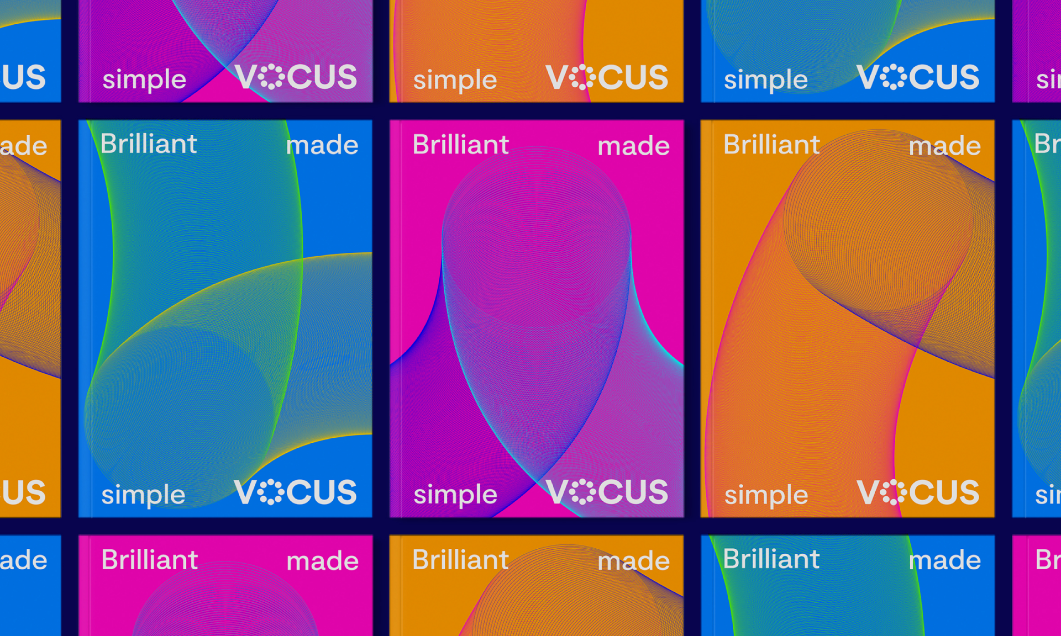
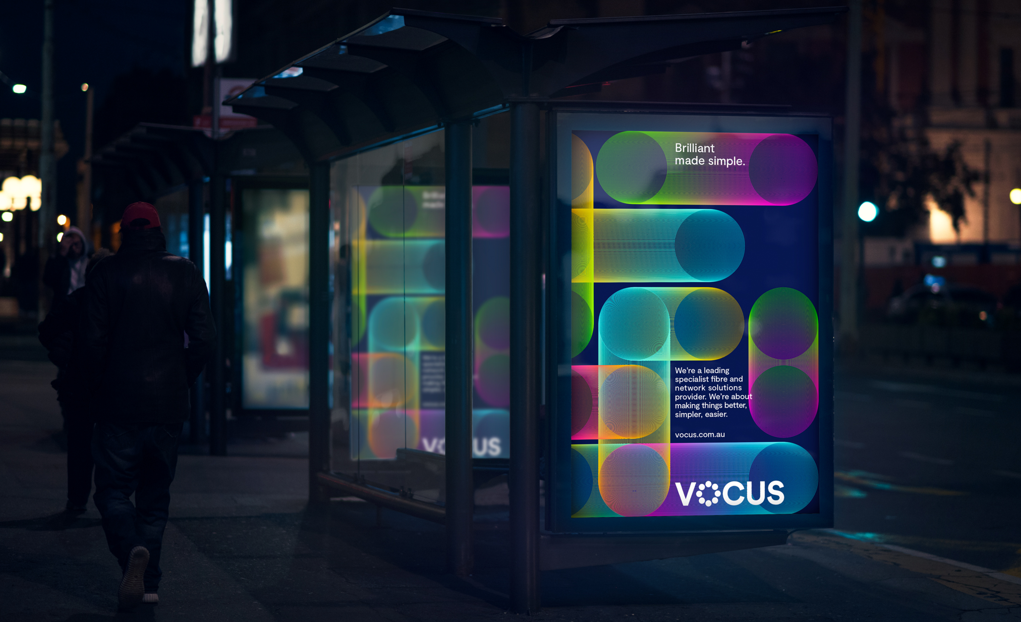
We dug deep into the business to reveal that their unique proposition hinged upon the notion of simplicity – in an industry where complexity surrounds. We developed the brand idea that captured these two distinct dynamics – ‘Brilliant Simplicity’. A perfect reflection of their pioneering people, a world-class network, a customer experience defined by control and ease, and a business with clarity at its core.
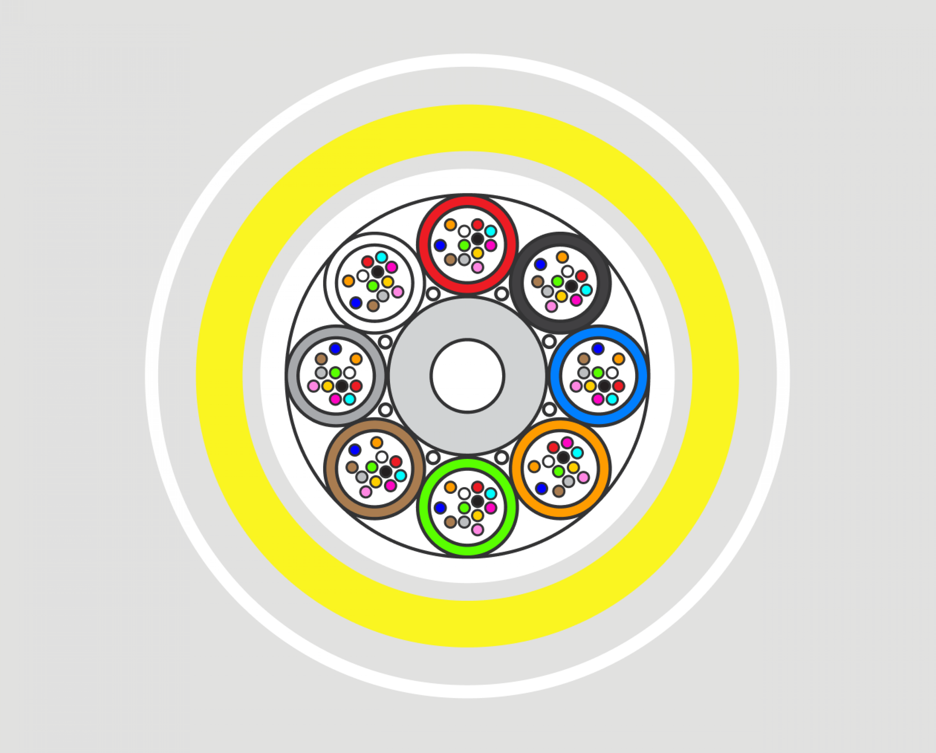
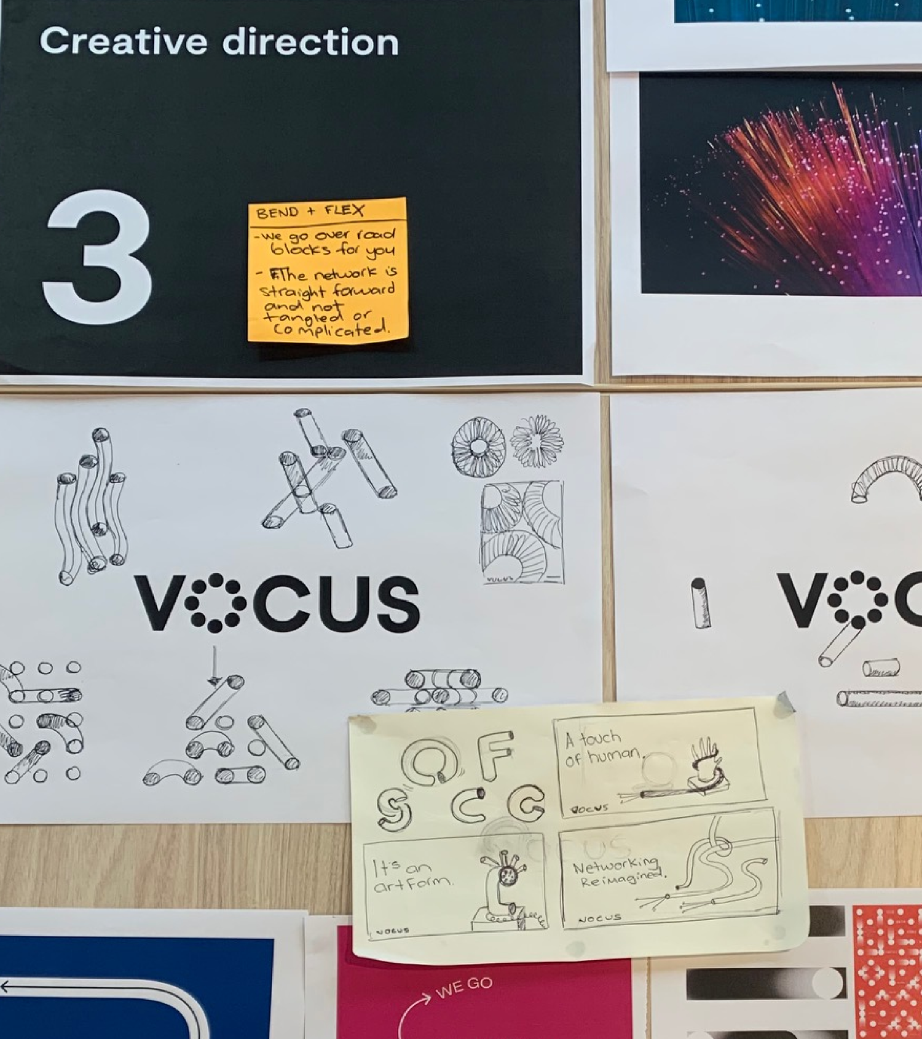
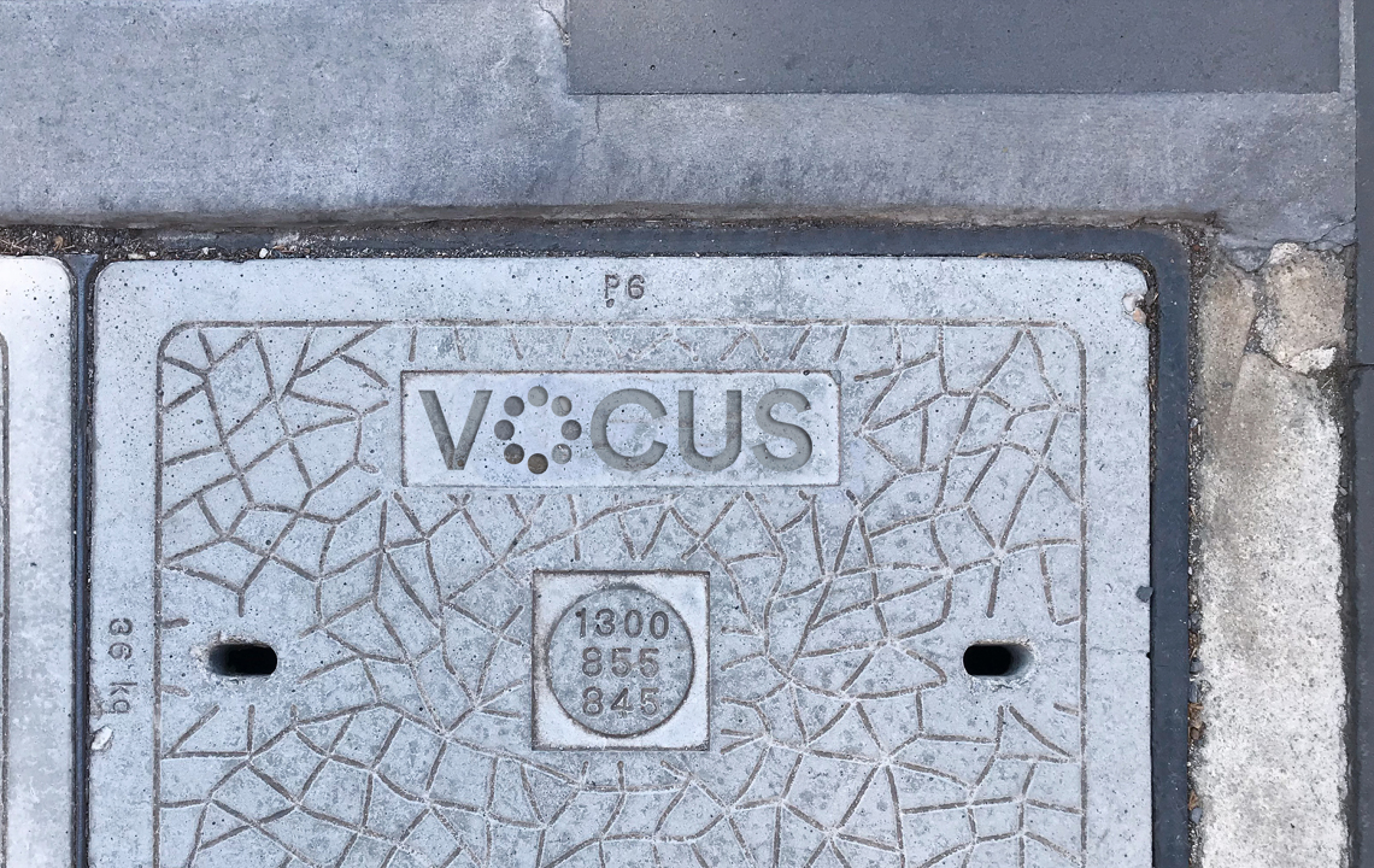
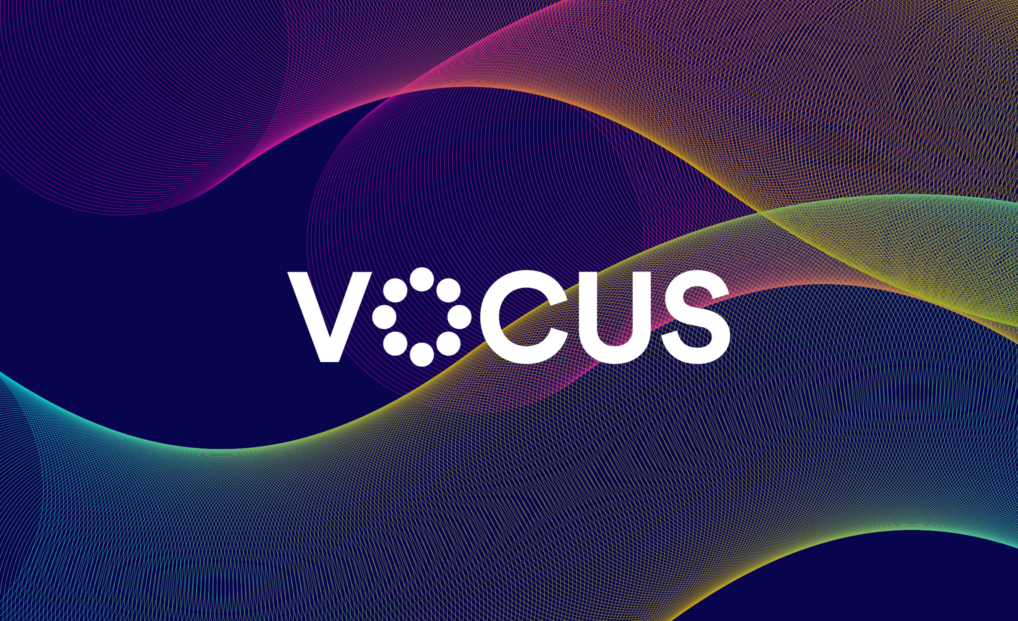
We then looked at Vocus’ brandmark – taking the best of the past and evolving it for a future world, imbued with new-found purpose and meaning. With greater visual presence and character, the refined logo communicates Vocus’ journey from a voice business to a fibre specialist, with the letter ‘O’ representing a cross-section of a typical fibre optic cable. The same fibre optic cables we referenced in the brandmark inspired a vibrant colour palette that could speak to Vocus’ diverse customers.
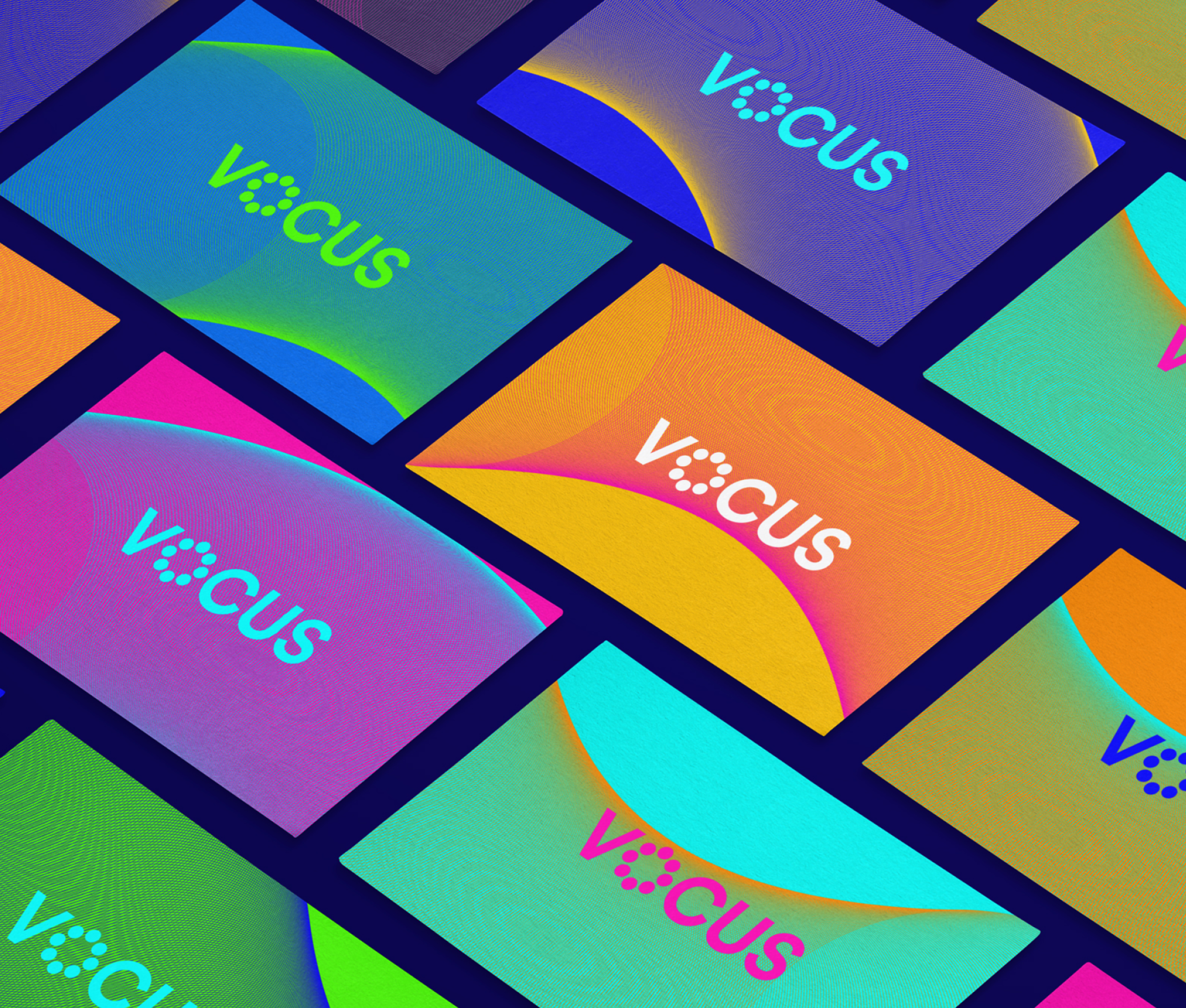
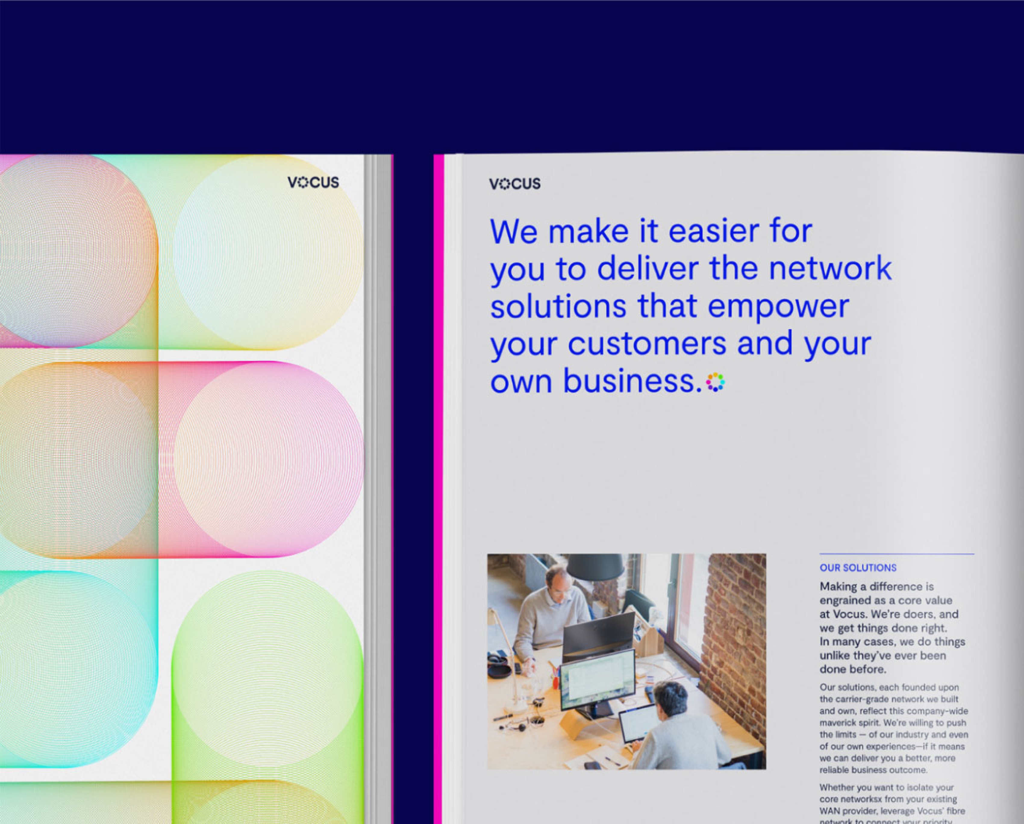
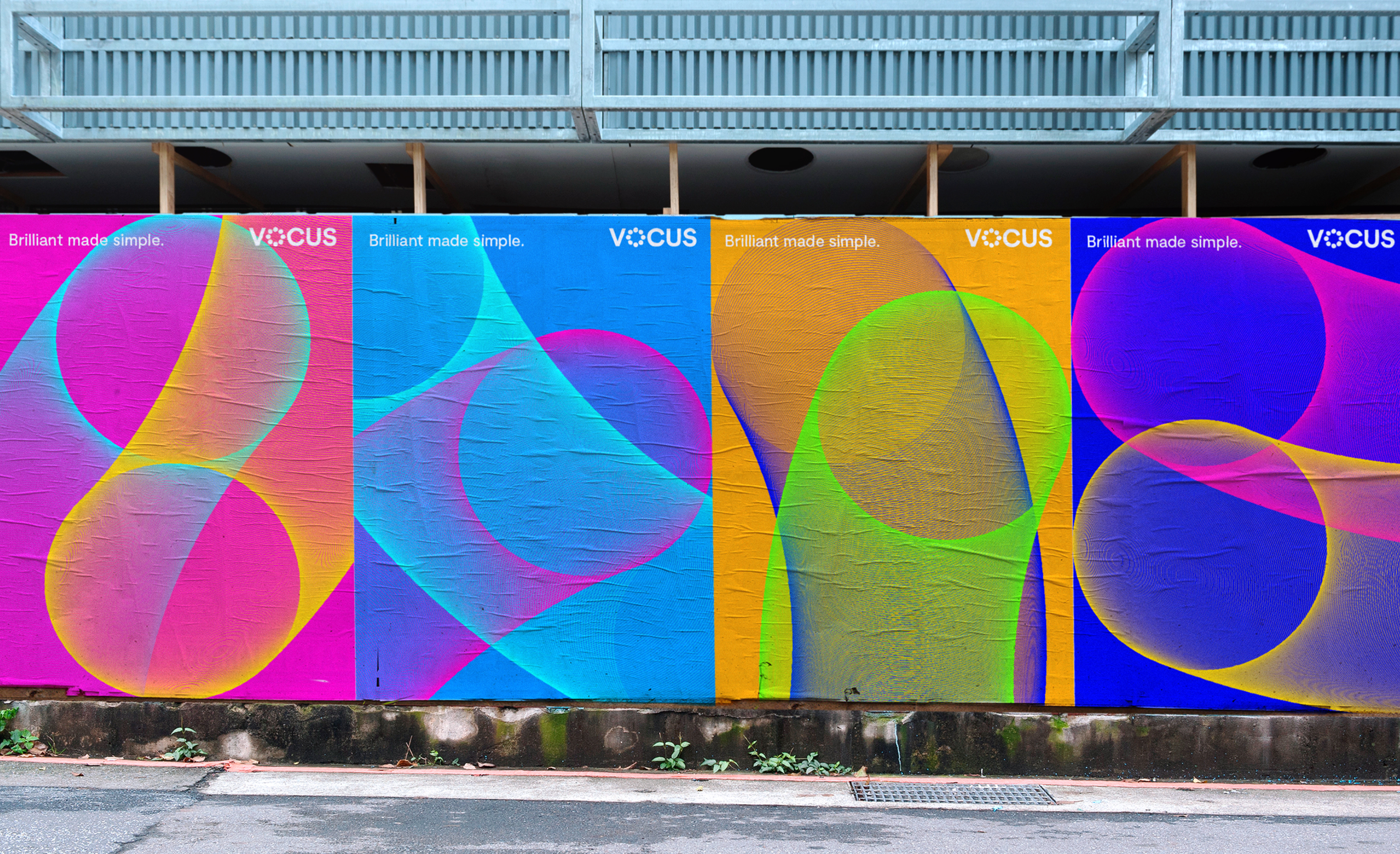
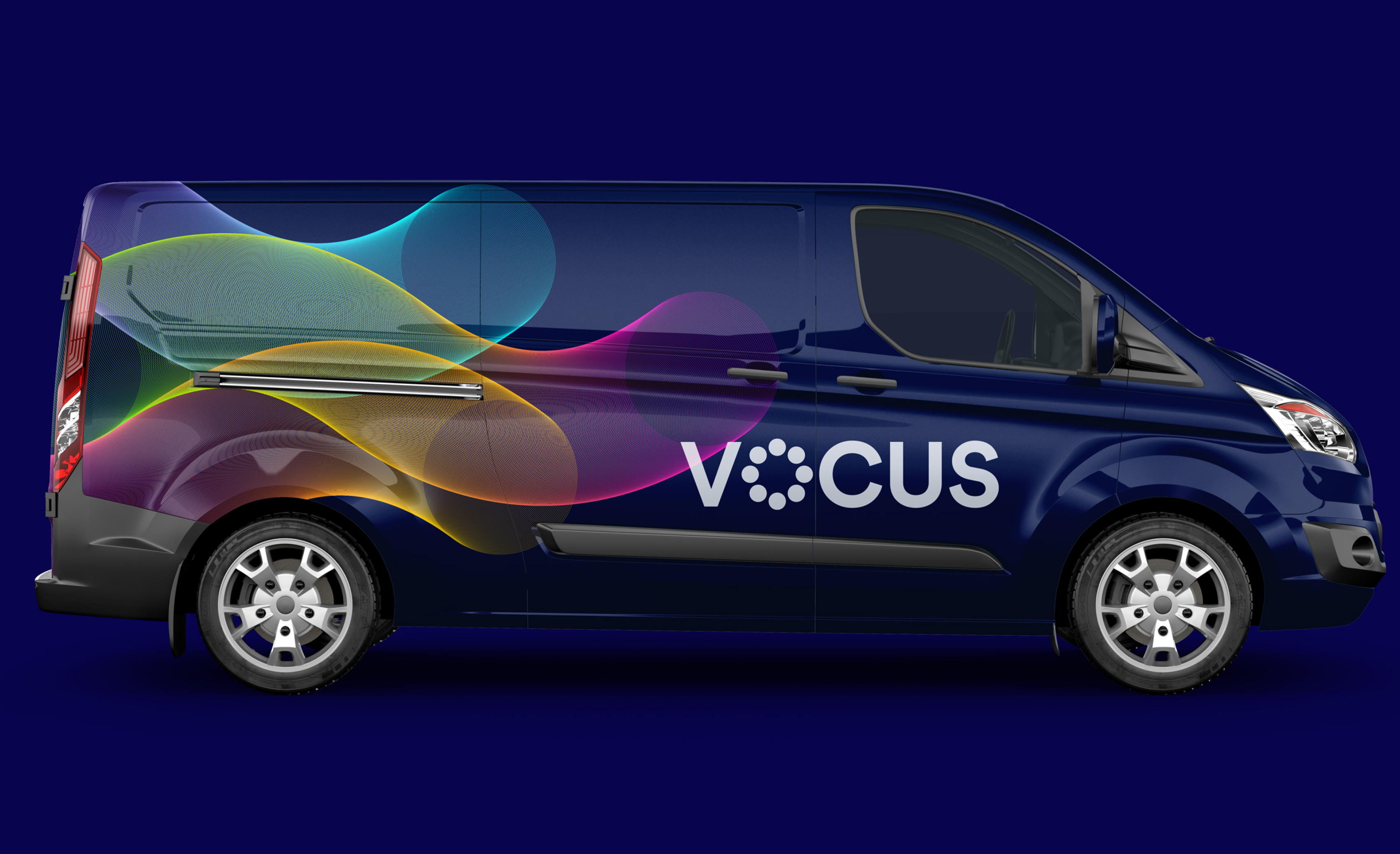
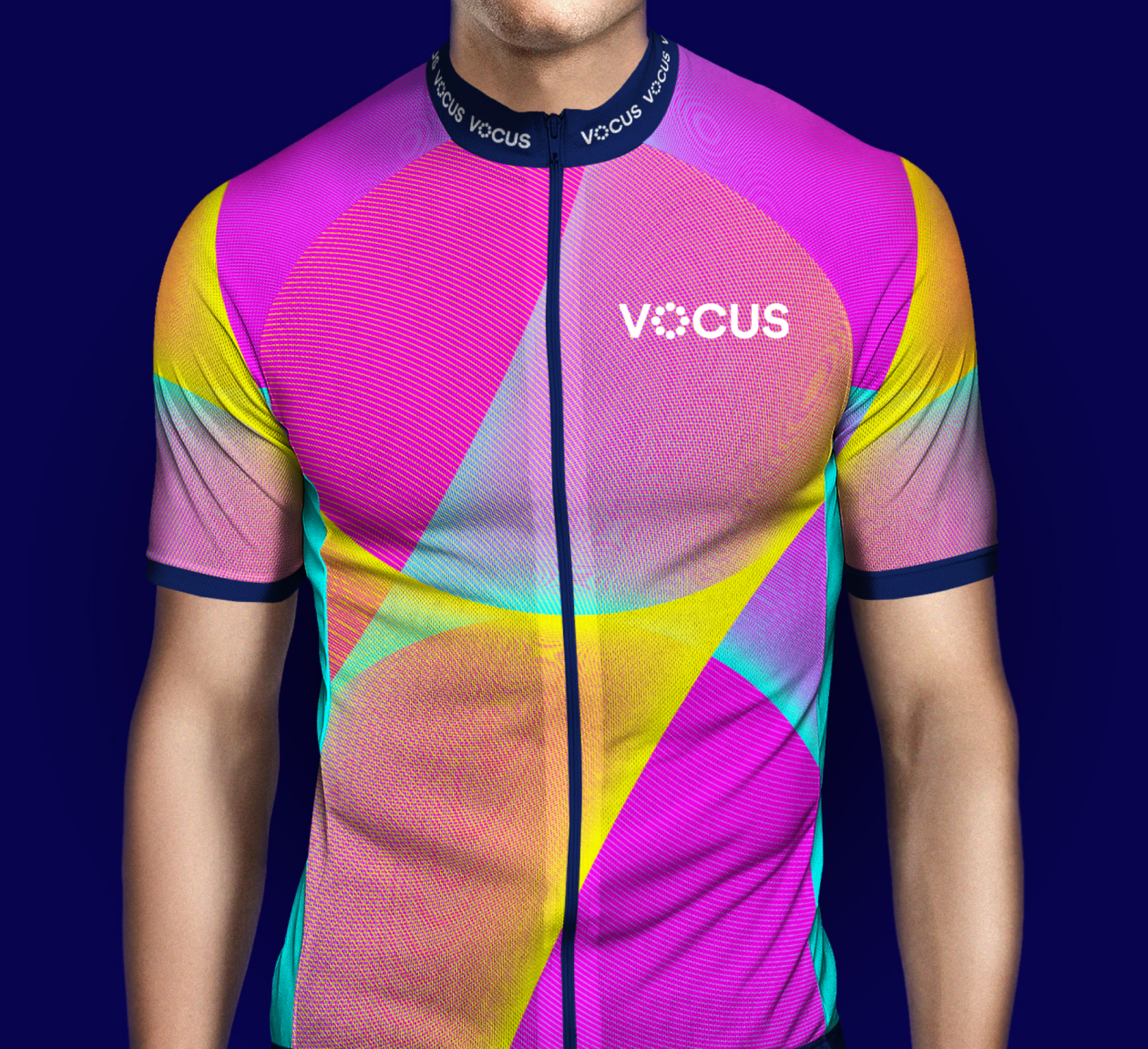
Next, we created a bespoke graphic system which gives life to the brilliance of Vocus’ world-class network and the simplicity of the experience it aims to deliver for customers. A system with added depth, breadth and meaning, with the flexibility to work across a variety of audiences and applications.