Once the technical build was complete, FutureBrand was tasked with building the brand strategy, brand identity, tools and experience to demonstrate the NPP’s utility and value, and to drive adoption for one and all, from innovative fintechs to everyday families.
- Technology
- Professional Services
- Finance
Sectors
- Stakeholder Engagement
- Brand Strategy
- Brand Architecture
- Naming
- Brand Identity
- Brand Language
- Customer Experience
- Brand Management
Services

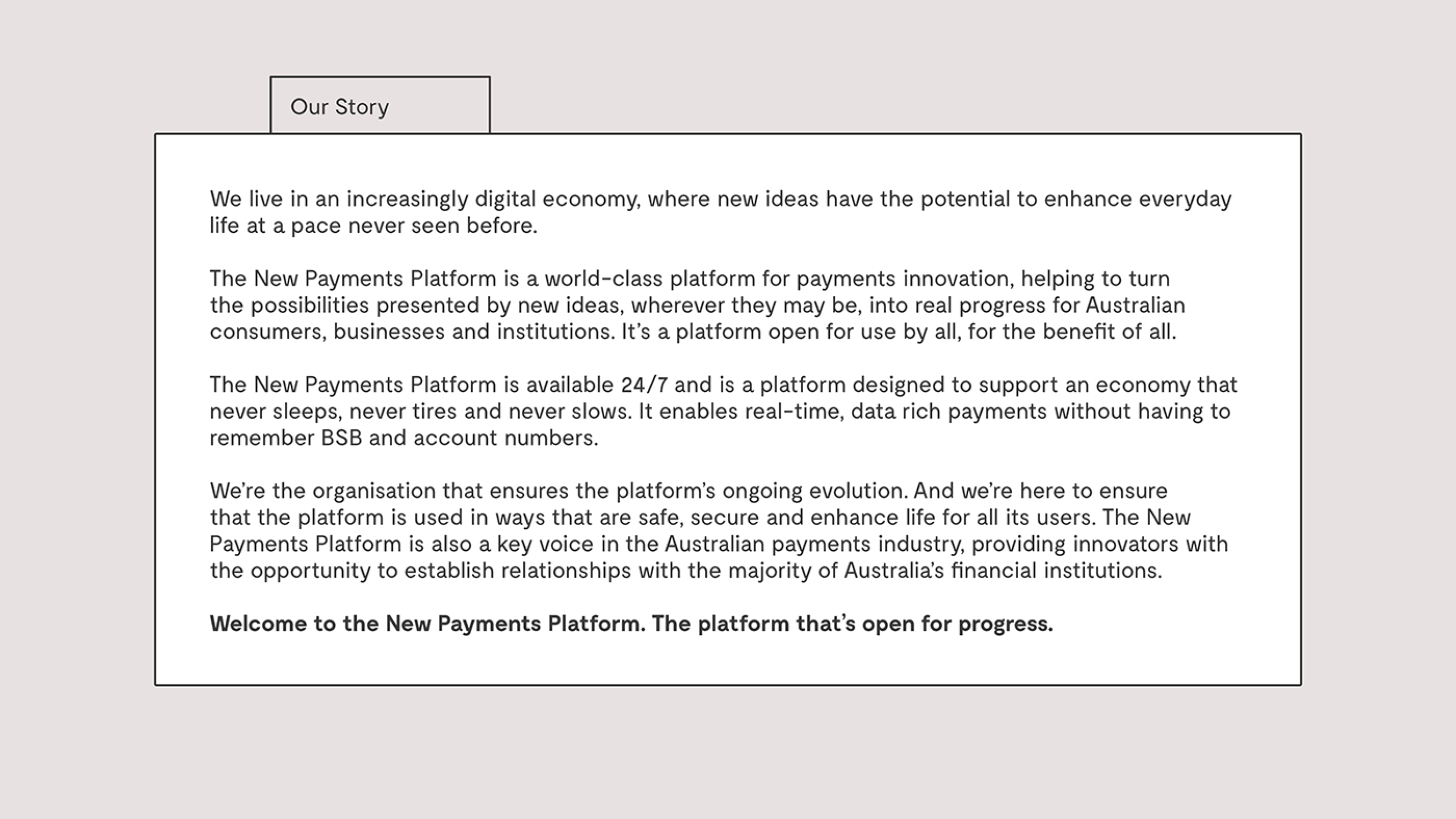
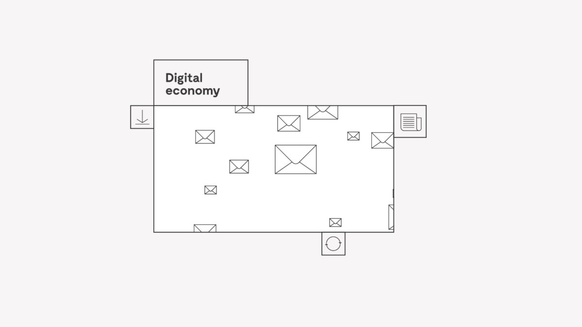
The New Payments Platform exists to help governments, corporations and fintechs create possibilities as yet unimagined in an increasingly digital economy. Looking beyond category conventions allowed us to focus on the platform’s ability to connect people, ideas and technology and to open doors to possibilities limited only by the imagination. But how do you ground the notion of what’s possible in something easy to understand and value?
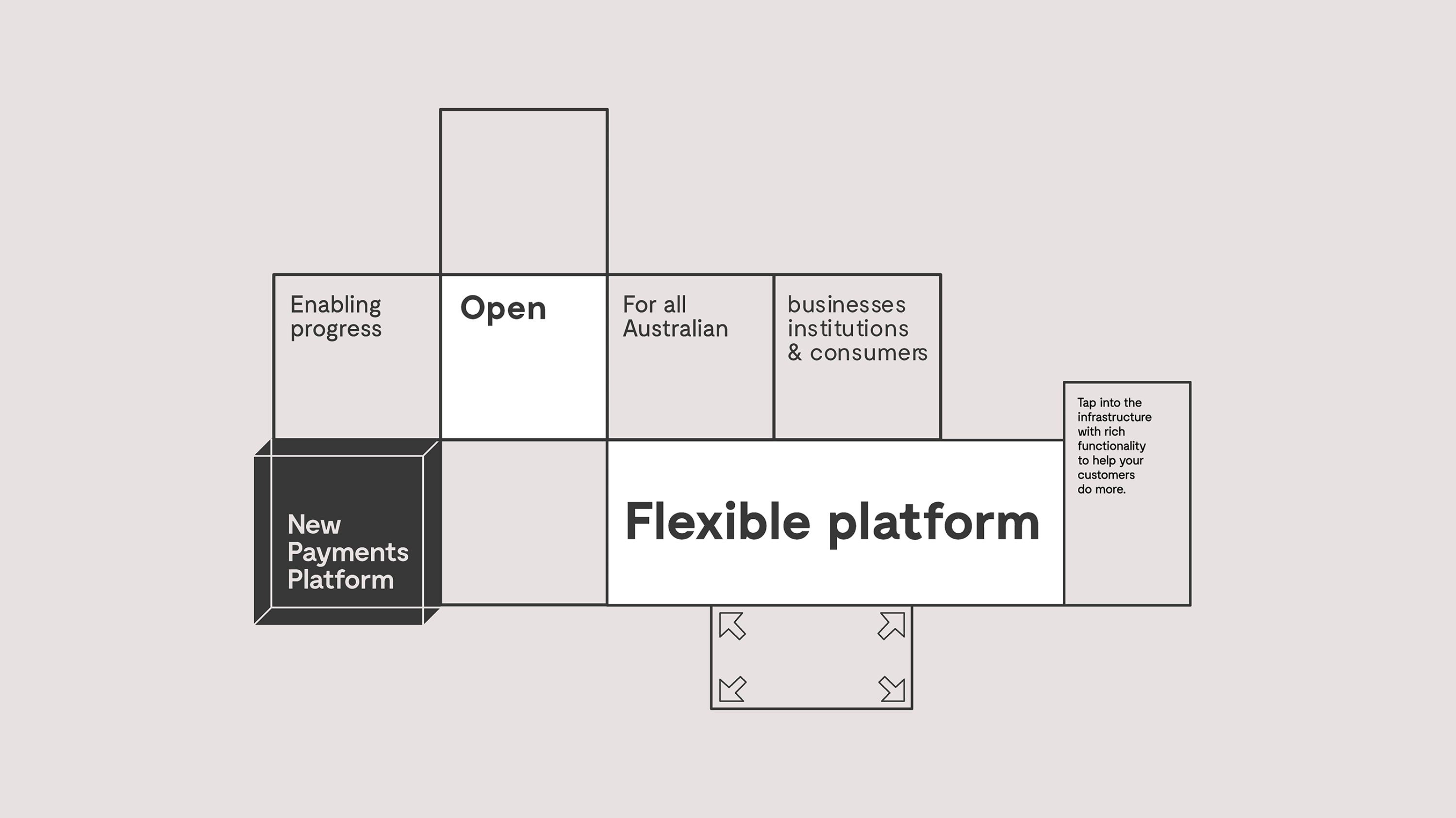
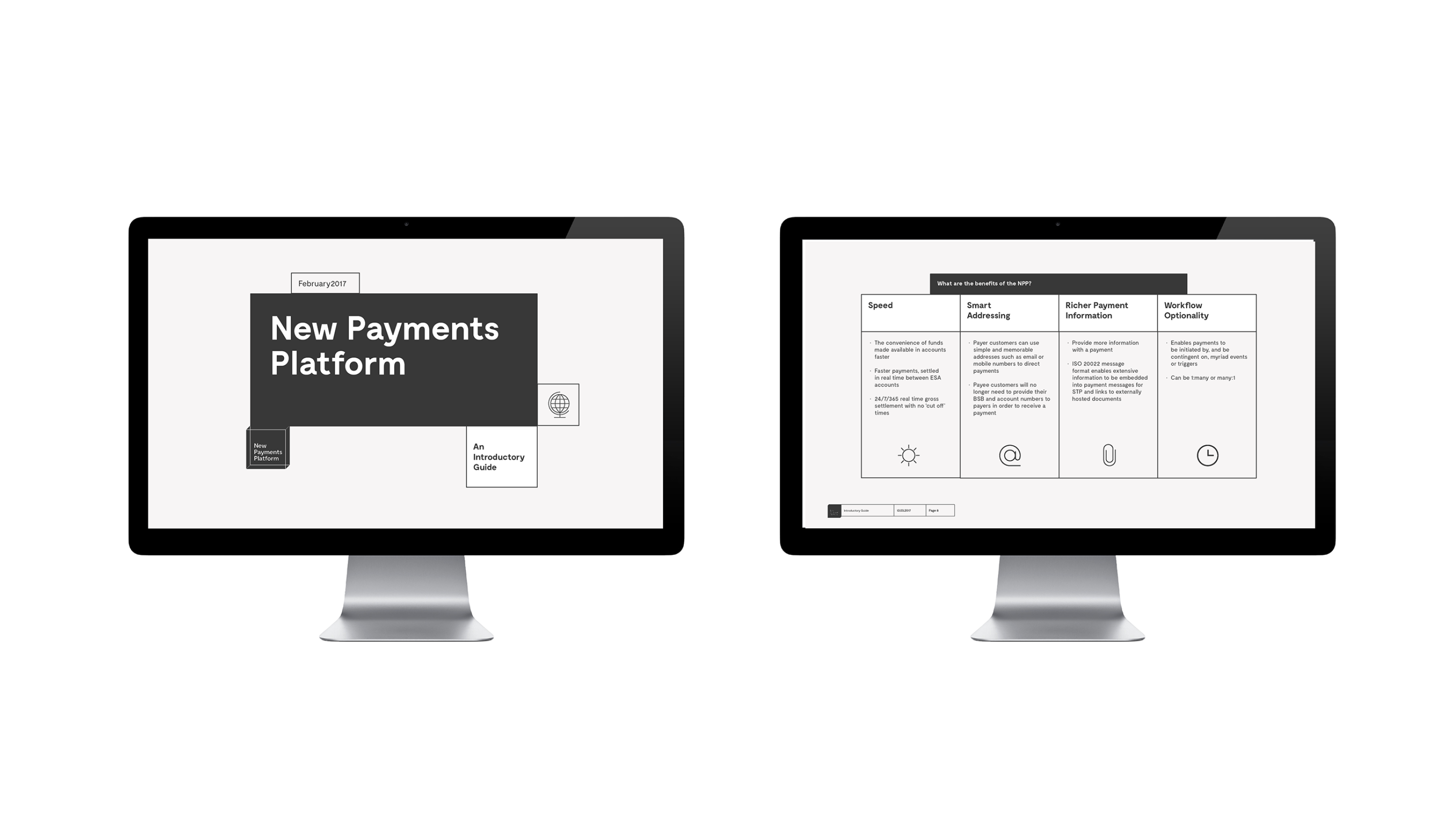
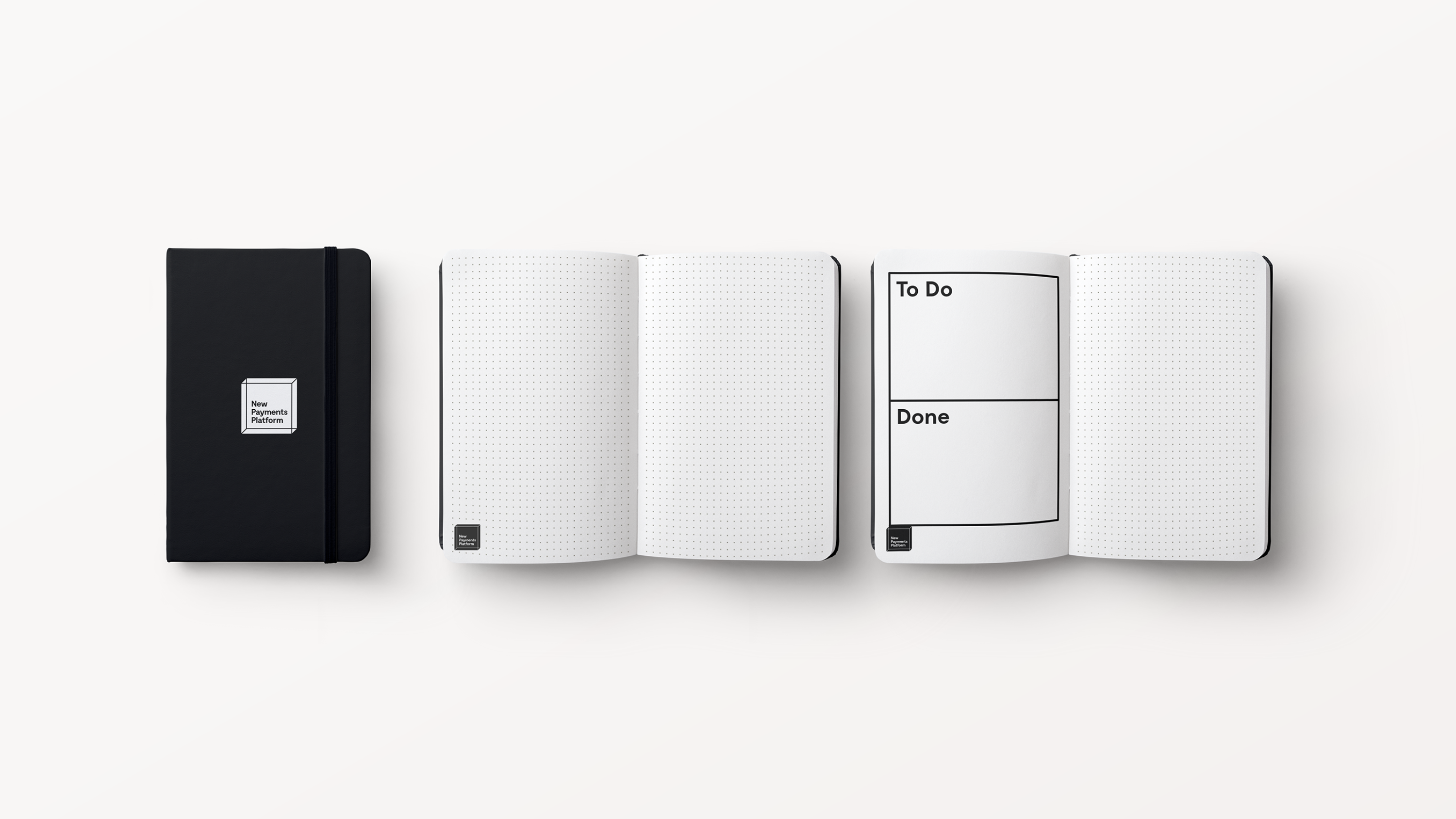
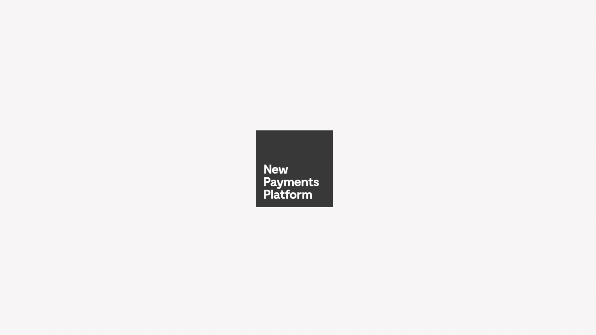
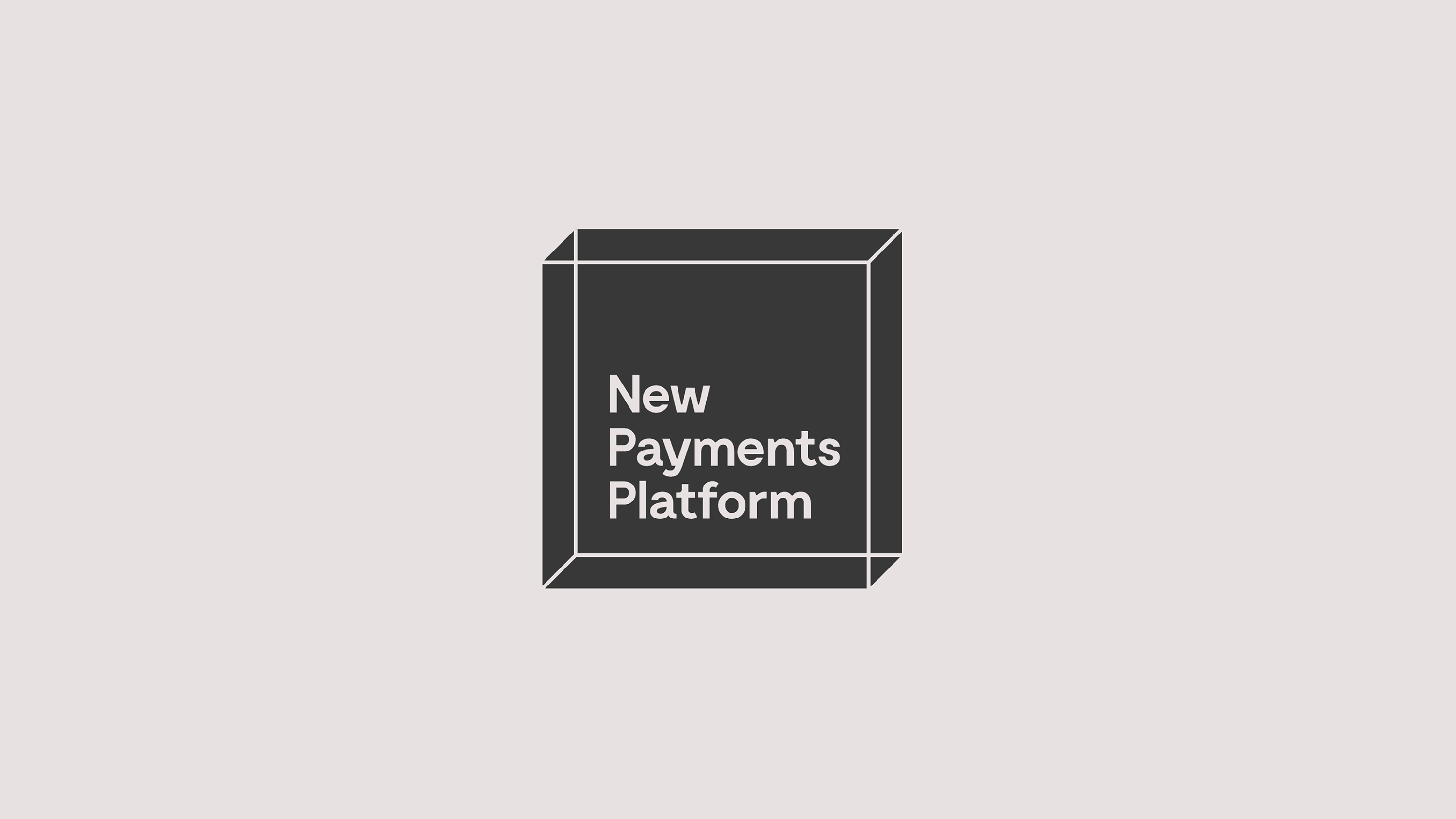
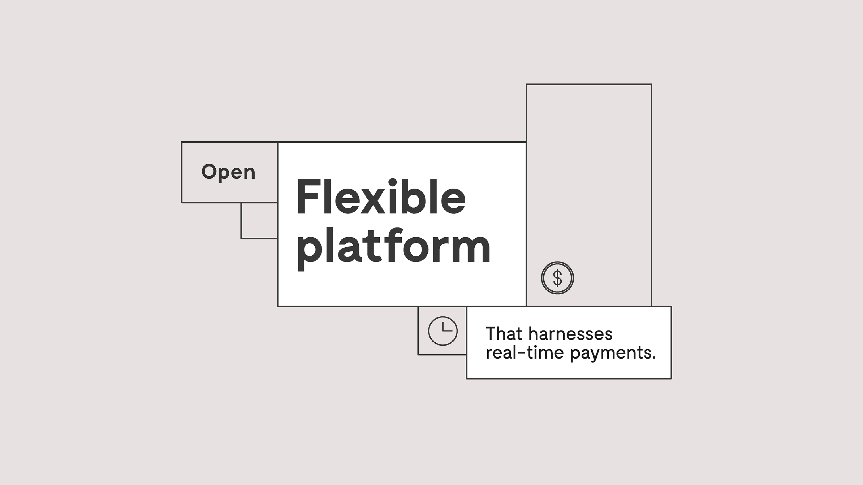
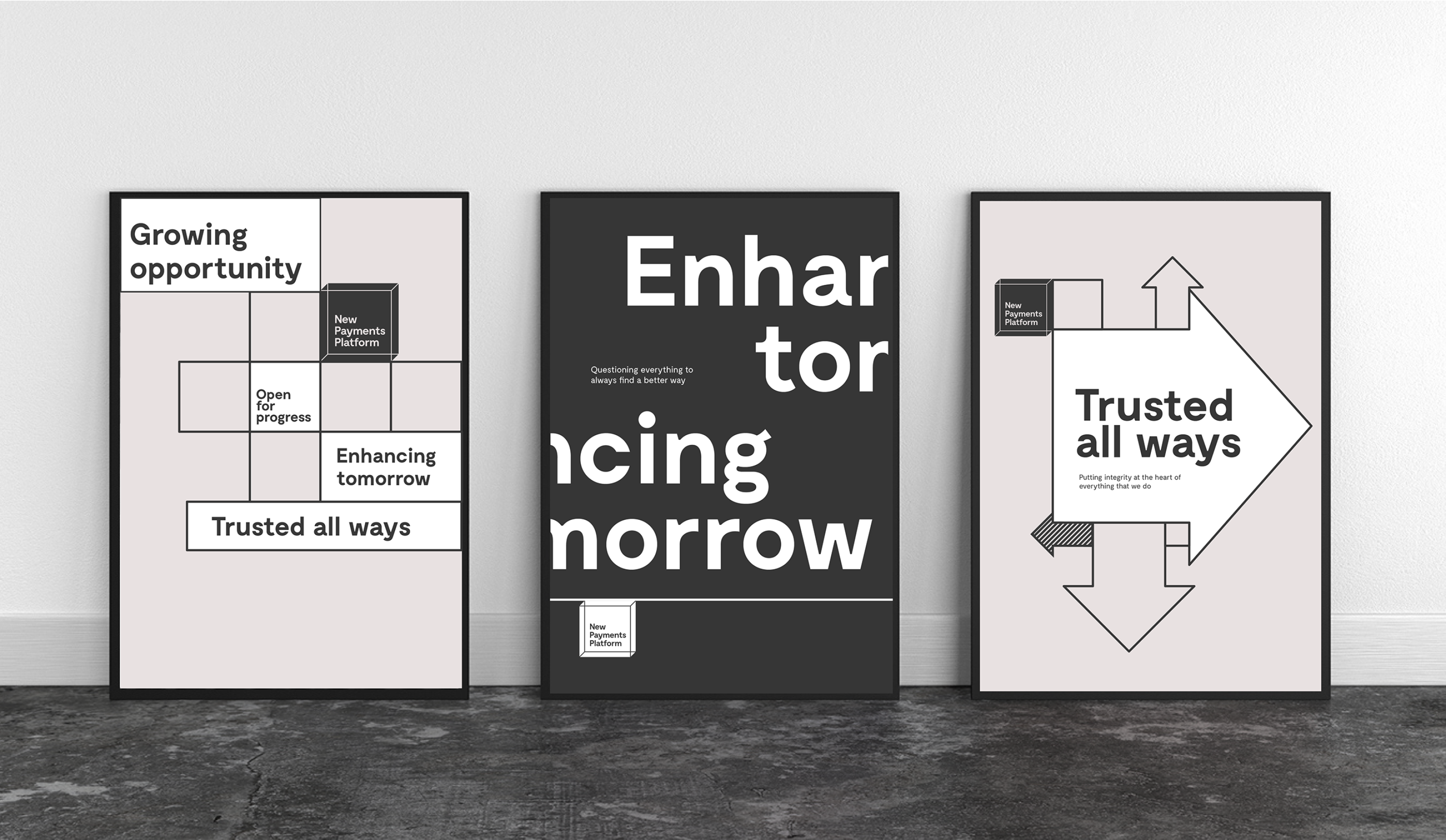
We developed the brand idea ‘Open for Progress’ and expressed it with a brand identity underpinned by simplicity and neutrality – two principles that were grounded in the fact that the platform needed to drive understanding across a range of users and to enable others’ efforts in creating the future. At first glance, the brand appears to be an inconspicuous box, but in fact reveals itself to be a clever system that supports the communication of complex information. The brand opens up to reveal a wealth of information in a staged and structured manner through simple, intuitive iconography and concise messaging that balances social impact with technical proof. The brand further flexes and stretches through a series of animations by which playful storytelling unfolds, complemented by a tone of voice that is visionary yet inviting.


"FutureBrand worked with us in a carefully considered way. We’re not a typical organisation, nor is our market offering, but FutureBrand applied deep research and strategic thinking to create a brand identity that simplifies the complexity of who we are and what we do."
Adrian Lovney
CEO
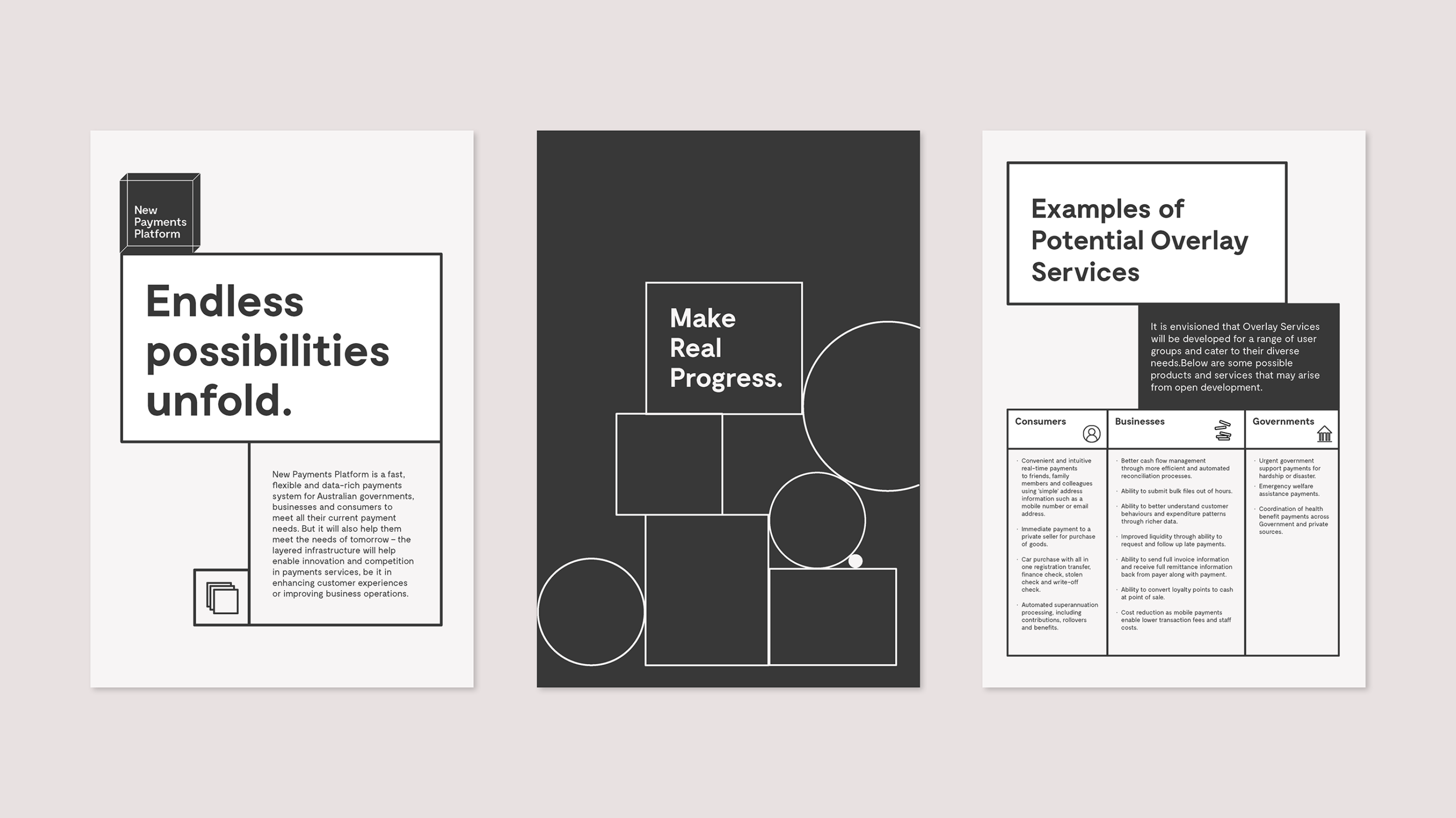
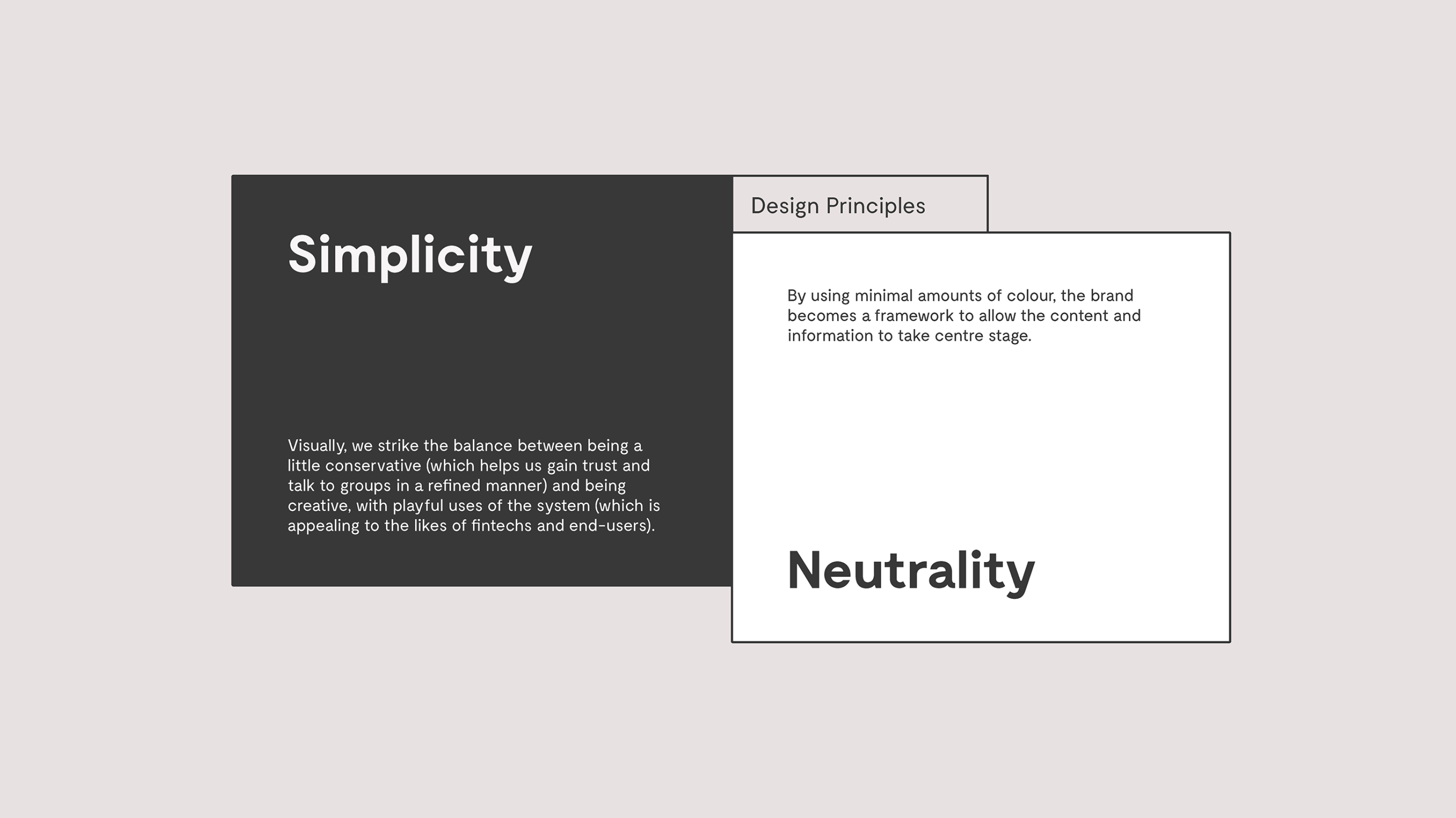
The visual identity created deliberately deviates from traditional financial services cues of speed and dynamism and colour palettes comprising fifty shades of blue. Instead, our design solution is based on the insight that it’s not the New Payments Platform itself that embodies the significance of the platform, but rather the organisations that cooperate with it and the innovators who enrich it with new ideas. Simplicity and neutrality were governing design principles, leading to a visual identity that intentionally sits in the background, with the confidence to champion its utility through the brands of others.
What seems to be an inconspicuous box is actually a clever visual system that opens up, unfolds, sizes and scales itself to fit the relevant communication in a simple but structured way – and using time, size and spatial arrangements to create beautiful information architectures.
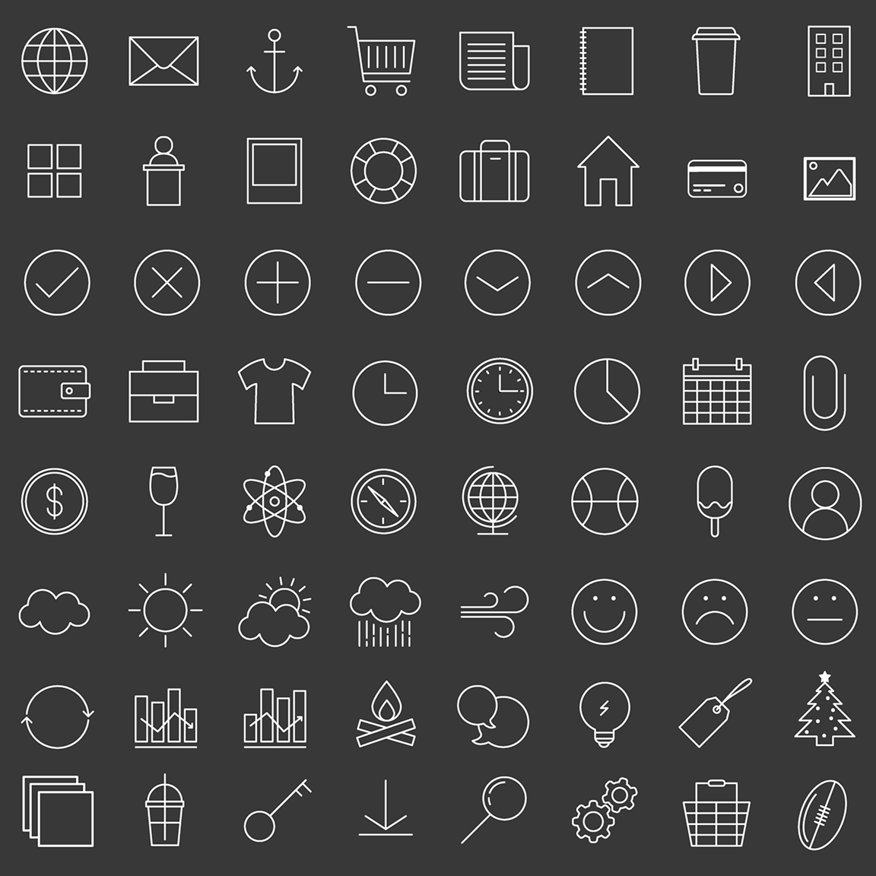
The visual identity is complemented by a suite of icons – to help convey the platform’s myriad benefits and functions – and a brand language and tone of voice that deviated from the category’s obsession with performance-oriented language, instead positioning the New Payments Platform as welcoming, inviting and adaptable. All up, the visual identity is more akin to an innovation consultancy than a technical platform.